Due to the sheer number of plotlyggplotly() interactive plots that the website would need to load if we had visualized all the LuciernagaIntegration() plots for the 29-fluorophore panel in one go, we have broken the exploration of the fluorophore outputs by laser. This walk-through if for the “Violet” laser.
To return to the main walk-through (including UV fluorophores), click here
For the violet fluorophore walk-through, click here
For the unstained samples walk-through, click here
Walk-through
Set Up
Attach your R packages to the local environment via the library() call.
library(dplyr)
Attaching package: 'dplyr'
The following objects are masked from 'package:stats':

    filter, lag
The following objects are masked from 'package:base':

    intersect, setdiff, setequal, union
library(purrr)library(flowWorkspace)
As part of improvements to flowWorkspace, some behavior of
GatingSet objects has changed. For details, please read the section
titled "The cytoframe and cytoset classes" in the package vignette:

  vignette("flowWorkspace-Introduction", "flowWorkspace")
library(Luciernaga)library(ggplot2)
Designate your file paths to the storage and output folder locations.
And bring in the template needed to run the LuciernagaIntegration() wrapper function (which we generated here).
And with that, we are set!
Violet
Having completed looking at the fluorophores with primary detectors on the Ultra Violet laser, we can now move on to the Violet laser. For many cells (especially after fixation), autofluorescence typically peaks around the “V7-A” or “V8-A” detector. This is worth keeping in mind, because behind the scenes LuciernagaIntegration() just processes normalized signatures of individual cells, groups them based on peak detector and additional peaks with relatively similar heights by detector.
Since not all cells will stain for the fluorophore (lacking the antigen the corresponding antibody would bind to), for a random cell single-color unmixing control the Luciernaga output might return signatures featuring different primary peaks (for both the fluorophore and autofluorescence). Since the goal is to get back the fluorophore signatures (and especially identify antibody vials where the tandem has broken down into individual components), Luciernaga needs a way to exclude out the usual autofluorescence peak detectors from the returned signatures. This is handled by the ‘AFOverlap’ argument
While this works quite well to return only the interesting signatures for most fluorophores, for the autofluorescence-similar fluorophores (BUV496, BV510, etc.) that share the same peak as the autofluorescence, this exclusion via the “AFOverlap” list can result in even the fluorophore signatures being excluded. To handle this, we can update the ‘AFOverlap’ data.frame to handle these known edge cases.
While these defaults work for most cases, you might need to modify the ‘AFOverlap’ data.frame for your panel. This can be both in cases where you are encountering rarer autofluorescences (usually around “V3-A” and “V10-A” for our panels), or when you are using a fluorophore on the same peak that has a different name (despite having the same signature, thank you manufacturers!)
With this bit of background needed in case we encounter any odd signatures in the process, we can now begin.
BV421
First up on the violet laser we have the BV421 fluorophore, conjugated to CD127 for this panel. While the fluorophore can be bright, the antigen expression will be a little less dense compared to CD3, CD4, CD8, etc., so my initial expectation is the overall MFI will end up somewhere in the middle.
Getting started, lets attempt to run using the default ‘AFOverlap’
Error in `map2()`:
ℹ In index: 1.
Caused by error in `Luciernaga_QC()`:
! There were no Retained detectors in DRCD127BV421
This kind of error is the one I typically encounter when the ‘AFOverlap’ ends up excluding all the primary detectors. Before starting, we can double check what BV421 should look like.
As we can see, the main fluorophore should be “V1-A”, but it is possible in this case the fluorophore might have degraded a tad and we are ending up with a co-equal with “V3-A” peak. We can modify the “AFOverlap” data.frame to account for this.
We can now re-run LuciernagaIntegration(), but point “AFOverlap” to our “UpdatedAFOverlap”
BV421 <-LuciernagaIntegration(template=KeptCells[8,], gs=CellsSC_GatingSet,GuessSimilar=TRUE, AFOverlap=UpdatedAFOverlap)[[1]] # Square brackets to loose list notation
Only a single peak detector present.
Normalizing Data for Signature Comparison
Alright, as we have done previously, we can check the “LinearSlices_Plot”, to see what effect would have been on the signature if we had split the region we had grabbed in our “positive” gate into 10% bins across.
plotly::ggplotly(BV421$LinearSlices_Plot)
Overall, similar signatures for the main fluorophore detectors, but there is a bit of a step-ladder visible around the “UV7-A” and “V7-A” detectors, suggesting our antigen-fluorophore combination is a bit dim.
Lets break out LuciernagaQC() output and see what the grouped individual cell normalized signature variants are up to.
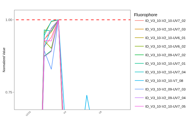
As we might have anticipated having seen step-ladders from ‘LinearSlices’, we have a mess on our hands. When looking at the normalized signatures, we are getting back step-ladders for both autofluorescence detectors. We can also see that instead of the “V1-A” peak detector that would be expected for “BV421” on the basis of the reference control, all signatures are coming back with primary peak detector as “V3-A” (co-equal to “V2-A” in some cases).
This might be instrument-specific (something being off on the laser or detector array), manufacturer variation, or the fluorophore is in rough-shape and degrading for some reason. To try to get a sense of the extent, lets run make out the main signature appearance by checking the QC_AmalgamatedPlot() output
So our “Average” signature is similar to “V3_10-V2_10-UV7_02”. We can examine the “ProportionPlot” output and identify the signatures that represent the majority of the cells present.
So “V3_10-V2_10-UV7_02” is representative of 36% of the individual cell signatures, with the slight variant for third peak ‘UV7_03’ being an additional 17%.
Lets retrieve the underlying data for this plot for these signatures, and one of those that has more of the step-ladder presence on “UV7”
Data <- BV421$AveragedSignature_Data |>filter(Cluster %in%c("V3_10-V2_10-UV7_05", "Average", "V3_10-V2_10-UV6_02"))
Lets pass these individually to QC_WhatsThis() and gage the difference for the cosine values vs. the reference.
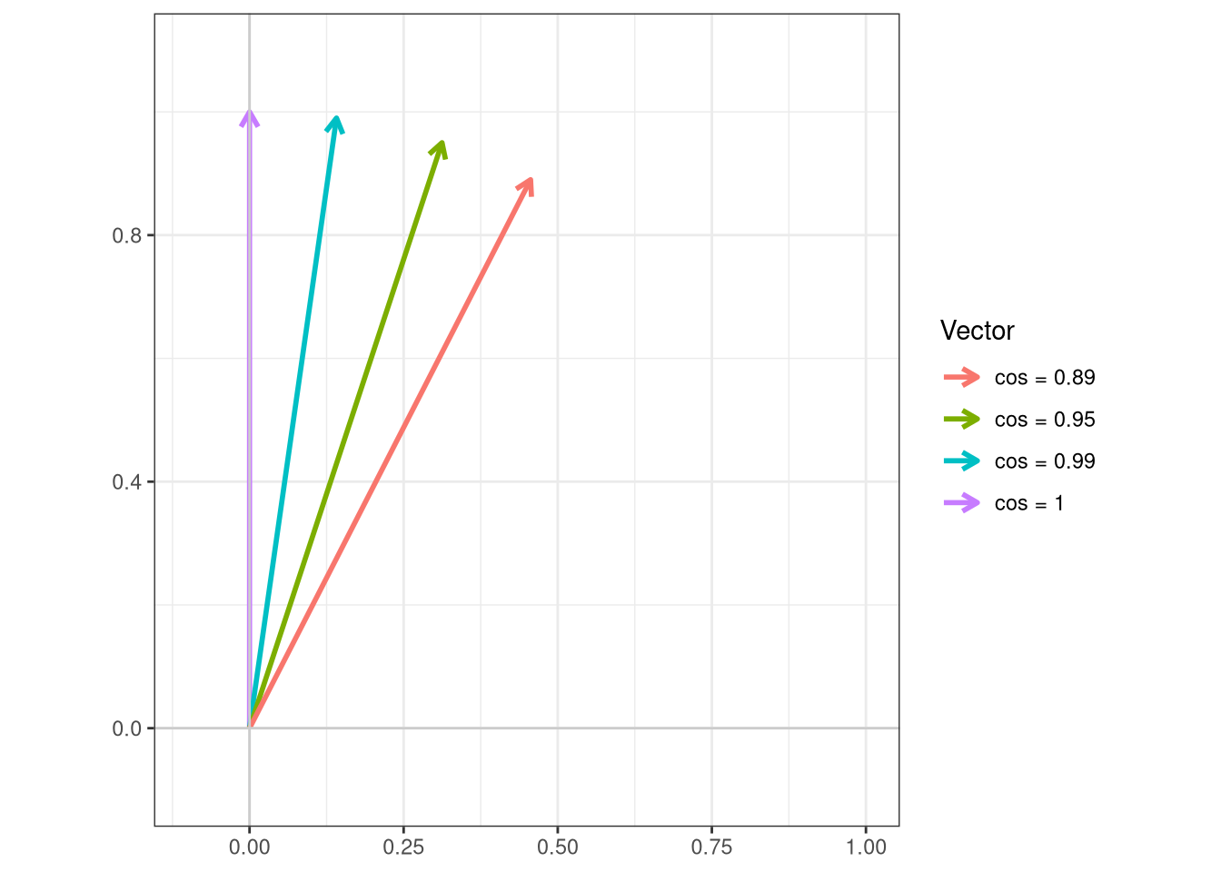
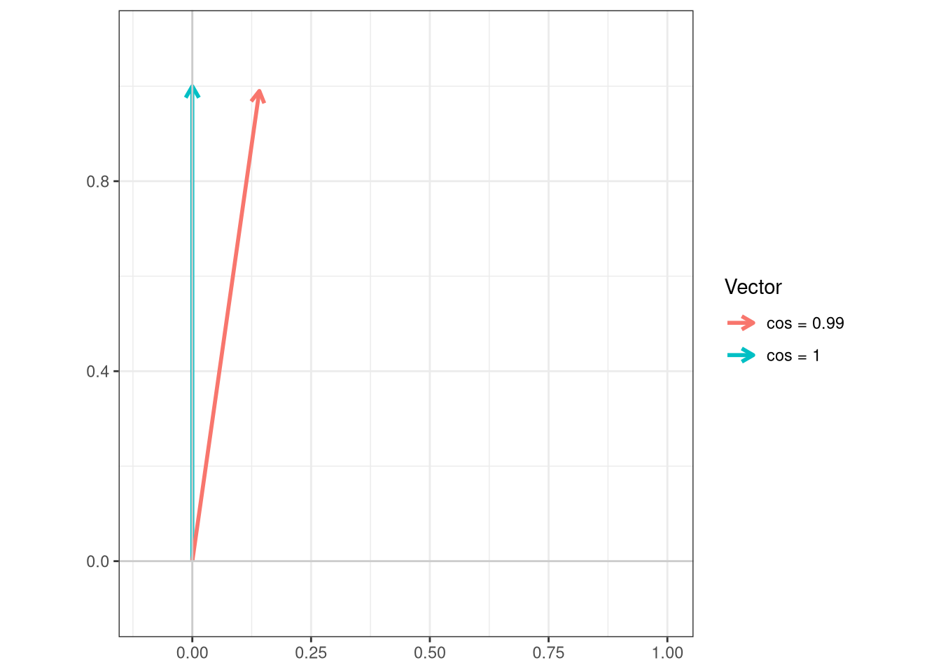
Overall, anywhere from from 0.89 to 0.99 in terms of their cosine. Lets plot these angles for reference
Code
cos_vals <-c(1, 0.99, 0.95, 0.89)theta <-acos(cos_vals)df <-data.frame(label =paste0("cos = ", cos_vals),angle_deg =round(theta *180/ pi, 1),x =sin(theta),y =cos(theta))ggplot(df) +geom_segment(aes(x =0, y =0, xend = x, yend = y, color = label),arrow =arrow(length =unit(0.25, "cm")),linewidth =1) +coord_fixed(xlim =c(-0.1, 1), ylim =c(-0.1, 1.1)) +geom_hline(yintercept =0, color ="grey80") +geom_vline(xintercept =0, color ="grey80") +labs(x =NULL, y =NULL, color ="Vector",title =NULL) +theme_bw()
Ultimately, still looks like just a mess.
WarningFail
For BV421, we are not getting any of the expected “V1-A” peak detector from any of the signatures. While around 20% of the cells still have signal similar to the reference, around 53% have signal with a cosine value of 0.95, with substantial autofluorescence residuals.
Moreover, “V3-A” is actually intended for our Pacific Blue fluorophore, so even in case we can still discriminate between the two, we will end up with more uncertainty/spreading in the unmixing than what would occur if the BV421 kept with it’s “V1-A” peak detector.
In this case, temporarily, I would severely move the gate to the right to try to exclude the variants, only keeping the brighter cells with hopefully less degraded fluorophore contributing to the overall signature. But I would also take a closer look at the antibody vial, since this might be a fluorophore in the vial breaking down level issue, in which case replacement might be the easier solution (and less overall headache long term).
Pacific Blue
Next up, we have Pacific Blue, which serves as the dump channel. For this particular unmixing control, it is conjugated with CD14. Consequently, expression would be primarily on the monocytes.
Given we are relying on the internal gate default for unmixing (which excludes the fluorophore positive cells), we might end up in a situation where we break rule # 2 of good unmixing controls, and are trying to subtract non-monocyte autofluorescence (B cells, T cells, CD14- non-classical Monocytes, CD14- Dendritic Cells, etc) from the CD14+ monocytes.
If the difference in autofluorescence is just brightness, since monocytes are brighter, this could result in taller autofluorescence residual peaks. However, if the monocytes are expressing different autofluorescent molecules that contribute to additional peaks, these would also not get subtracted out. These are a couple things we will need to keep an eye out for should we encounter them (and swap in an external unstained for background subtraction if needed).
With these notes of caution, we can attempt to run LuciernagaIntegration() after updating our “AFOverlap” data.frame (since Pacific Blue’s peak is supposed to be “V3-A”)
PacificBlue <-LuciernagaIntegration(template=KeptCells[9,],gs=CellsSC_GatingSet, GuessSimilar=TRUE, AFOverlap = UpdatedAFOverlap)[[1]] # Square brackets to loose list notation
Only a single peak detector present.
No second peak
Normalizing Data for Signature Comparison
Only one signature retrieved for Pacific Blue , Cosine not run
Alright, as we have done previously, we can check the “LinearSlices_Plot”, to see what effect would have been on the signature if we had split the region we had grabbed in our “positive” gate into 10% bins across.
plotly::ggplotly(PacificBlue$LinearSlices_Plot)
All differences for the signatures across the bins are pretty much undistinguishable from each other. Lets break out LuciernagaQC() output and see if this is also the case for the grouped individual cell normalized signature variants are up to.
Only one signature present, so the antigen-fluorophore combination is bright enough to drown out any variation. Lets pass these individually to QC_WhatsThis() and gage the difference for the cosine values vs. the reference.
Data <- PacificBlue$AveragedSignature_Data |>filter(Cluster %in%c("Average"))
Wow, that’s a lot of manufacturer synonyms for exactly the same fluorophore! But yeah, our Pacific Blue matches its reference, so no additional steps are needed in this cae.
TipPass
Only one signature variant was present for Pacific Blue, which matched the reference signature, so all is good for this particular combination. Next!
BV480
Up next, we reach BV480, which was direct conjugated to CD161. Many T and NK cells will be positive for CD161, but it will be especially bright on Mucosal-associated Invariant Cells (MAITs). However, similar to other Innate-like T cell subsets, their abundance might vary from donor-to-donor, so without additional information, we are not entirely sure how many we will encounter for the PBMCs of this adult donor.
BV480 <-LuciernagaIntegration(template=KeptCells[10,],gs=CellsSC_GatingSet, GuessSimilar=TRUE)[[1]] # Square brackets to loose list notation
Only a single peak detector present.
Normalizing Data for Signature Comparison
Lets first take a look at the “LinearSlices_Plot”, to see what effect would have been on the signature if we had split the region we had grabbed in our “positive” gate into 10% bins across.
Few minor shifts here and there across the signatures from each 10% bins, but nothing horrid compared to some of the other fluorophores we have checked.
We can next check out the LuciernagaQC() output to see how many signature variants we encounter when we group normalized signatures of the individual cells
We end up getting back two relatively similar signatures. Some of these small differences may result from how LuciernagaQC() rounds up, and may not be all that meaninful in actual practice. We can check if there is a main signature by checking the QC_AmalgamatedPlot() output
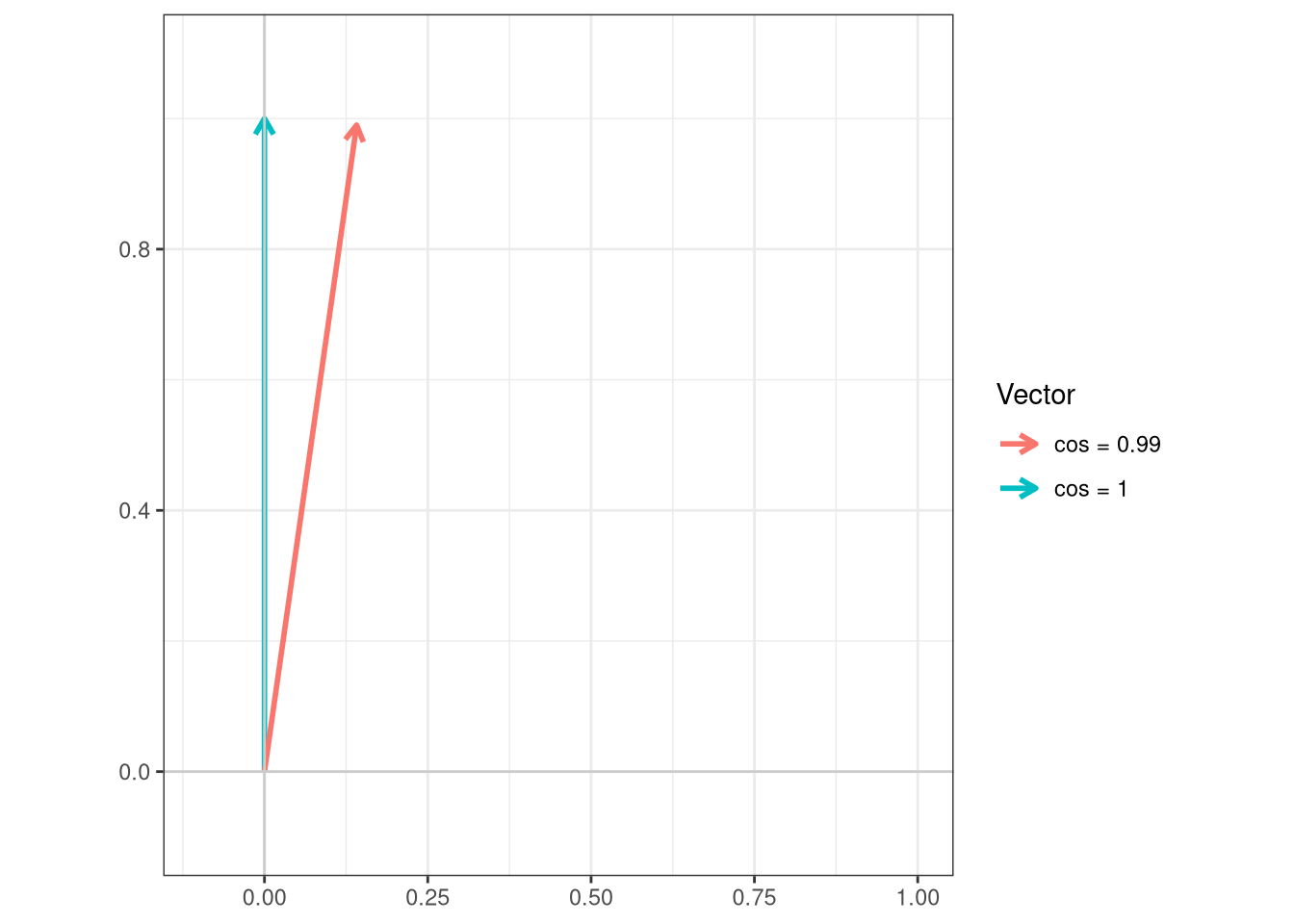
And lets plot the cosine difference vs. the reference
Code
cos_vals <-c(1, 0.99)theta <-acos(cos_vals)df <-data.frame(label =paste0("cos = ", cos_vals),angle_deg =round(theta *180/ pi, 1),x =sin(theta),y =cos(theta))ggplot(df) +geom_segment(aes(x =0, y =0, xend = x, yend = y, color = label),arrow =arrow(length =unit(0.25, "cm")),linewidth =1) +coord_fixed(xlim =c(-0.1, 1), ylim =c(-0.1, 1.1)) +geom_hline(yintercept =0, color ="grey80") +geom_vline(xintercept =0, color ="grey80") +labs(x =NULL, y =NULL, color ="Vector",title =NULL) +theme_bw()
TipPass
For BV480, both signatures are highly similar to each other, and the more abundant of the two matches the reference signatures in cosine. We can keep the gate as is and proceed to the next fluorophore.
BV510
Reaching the middle of the laser peak emissions, we have BV510, conjugated to CD45RA.This typically is one of the fluorophores most similar to autofluorescence (alongside BUV496). However, being paired with CD45RA, staining on cord blood blood mononuclear cells, the signal will likely be fairly bright across the board. We can go ahead and run LuciernagaIntegration() to generate out the respective outputs.
BV510 <-LuciernagaIntegration(template=KeptCells[11,],gs=CellsSC_GatingSet, GuessSimilar=TRUE)[[1]] # Square brackets to loose list notation
Only a single peak detector present.
Normalizing Data for Signature Comparison
Only one signature retrieved for BV510 , Cosine not run
Lets first take a look at the “LinearSlices_Plot”, to see what effect would have been on the signature if we had split the region we had grabbed in our “positive” gate into 10% bins across.
Pretty much no difference in signature across the bins. To confirm this, we can next check out the LuciernagaQC() output to see how many signature variants we encounter when we group normalized signatures of the individual cells
        Fluorophore ID_Average
1             BV510       1.00
2    LIVE DEAD Aqua       0.99
3 Viobility 405-520       0.97
4       Zombie Aqua       0.97
5          VioGreen       0.96
TipPass
For BV510, the antibody-fluorophore combination resulted in signature bright enough that any variation was minimal, so only one signature was retrieved. Since this matches the reference control, we are good to proceed.
BV605
Continuing on, we reach BV605, which is conjugated to CD56. This marker should be present on Natural Killer (NK) cells in the samples, with a subset appearing bright. This proportion of “bright” CD56 cells might vary across individual donors. Since this cell single-color unmixing control was prepared using cord blood mononuclear cells, which can range from 30-60% NK cells, if nothing else, we should have enough events :D
BV605 <-LuciernagaIntegration(template=KeptCells[12,],gs=CellsSC_GatingSet, GuessSimilar=TRUE)[[1]] # Square brackets to loose list notation
Only a single peak detector present.
Normalizing Data for Signature Comparison
First up, lets glance at the “LinearSlices_Plot”, to see what effect would have been on the signature if we had split the region we had grabbed in our “positive” gate into 10% bins across.
From the signatures we retrieve from the 10% bins, we can see a bit of a step-ladder peaking around “V3-A”. This is not the usual location for an autofluorescence residual shoulder, but given the fluorophore’s main peak at “V10-A” is drowning out the usual location of “V7-A”, its possible we are only seeing part of the story.
Having noted this, lets check out the LuciernagaQC() grouped individual cell normalized signatures output stored under “LuciernagaQC_Signatures”.
Glancing at the retrieved signatures, they all look relatively similar, with the little variation encountered being minor differences in the peak height (with splits between signatures likely driven by how Luciernaga_QC() is rounding the original values)
Lets visualize this same plot in an alternative fashion, checking to see where the median signature ends up by comparison.
Outside of small differences in “YG3-A”, everything is fairly uniform. Lets check the proportion plot to see how these signature variants are distributed across the gated cell population.
So overall, the brighter “YG3-A” variants are around 15% of the total gated cells, with the dimmer versions present for all the other cells.
Lets retrieve the underlying data for this plot, and keep the Average, as well as variants with minimal and maxinum autofluorescence contribution of the autofluorescence peak.
Data <- BV605$AveragedSignature_Data |>filter(Cluster %in%c("V10_10-YG3_05-UV10_03", "Average", "V10_10-YG3_04-UV10_02"))
Lets pass these individually to QC_WhatsThis() and gage the difference.
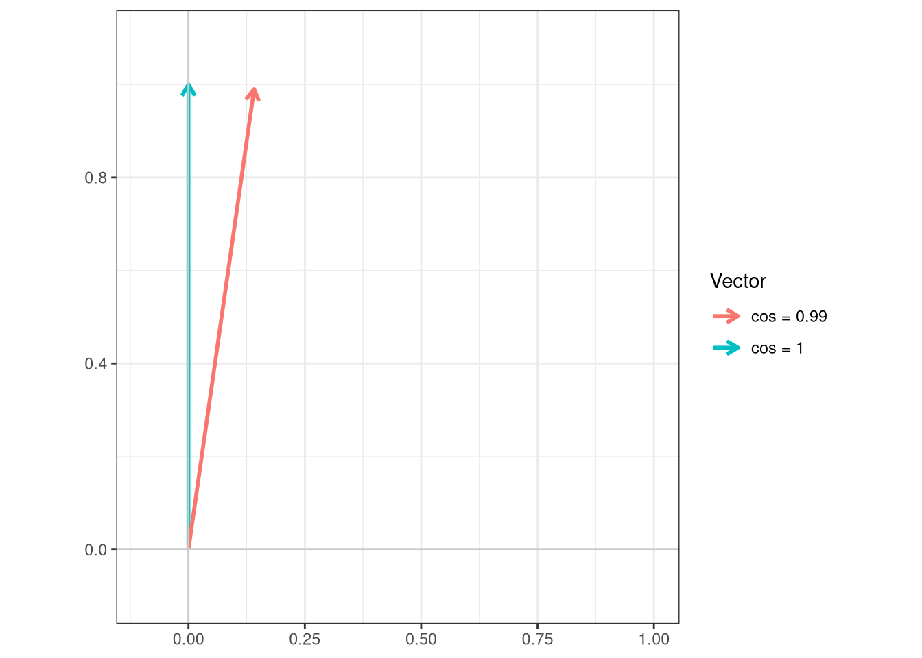
So pretty similar, lets remember how tiny the difference is
Code
cos_vals <-c(1, 0.99)theta <-acos(cos_vals)df <-data.frame(label =paste0("cos = ", cos_vals),angle_deg =round(theta *180/ pi, 1),x =sin(theta),y =cos(theta))ggplot(df) +geom_segment(aes(x =0, y =0, xend = x, yend = y, color = label),arrow =arrow(length =unit(0.25, "cm")),linewidth =1) +coord_fixed(xlim =c(-0.1, 1), ylim =c(-0.1, 1.1)) +geom_hline(yintercept =0, color ="grey80") +geom_vline(xintercept =0, color ="grey80") +labs(x =NULL, y =NULL, color ="Vector",title =NULL) +theme_bw()
TipPass
Overall, our BV605 single-color unmixing control is in good shape, with the retrieved signature variants being minor, and not overly represented in the gating population. If I really wanted to, we could move the gate 1 mm to the right to likely eliminate them, but for now, next fluorophore!
BV650
Next up on the hot-seat, we have BV650, conjugated to CCR7. With this fluorophores primary peak being on “V11-A”, it is unlikely to overlap directly on the main autofluorescence peaks, which means we might start seeing the autofluorescence residual peaks more clearly going forward.
BV650 <-LuciernagaIntegration(template=KeptCells[13,],gs=CellsSC_GatingSet, GuessSimilar=TRUE)[[1]] # Square brackets to loose list notation
Only a single peak detector present.
Normalizing Data for Signature Comparison
Lets first take a look at the “LinearSlices_Plot”, to see what effect would have been on the signature if we had split the region we had grabbed in our “positive” gate into 10% bins across.
Glancing at the signatures retrieved across the bins, fairly consistent around the fluorophore peaks, but a bit of uncertainty/step-ladder appearance around the “V7-A” (consistent with autofluorescence residuals). With this noted, we can check the LuciernagaQC() output for the grouped individual cell normalized signatures being stored under “LuciernagaQC_Signatures”.
All things said and done, fairly similar signatures, minor wobble around the “V7-A” detector. Lets see where the main signature ends up at by checking the QC_AmalgamatedPlot() output
Which in turn, reflects the proportion of cells within our positive gate that were grouped together on the basis of shared signature at the individual cell level.
So overall, 97% of the cells are in the not picking up significant autofluorescence residual camp. Next up, lets compare the “Average and two other signature variants vs. each other using QC_WhatsThis().
Data <- BV650$AveragedSignature_Data |>filter(Cluster %in%c("V11_10-YG4_02-R2_02", "Average", "V11_10-YG4_03-R2_01"))
If we visualized the difference in the cosines, we would see the following
Code
cos_vals <-c(1, 0.99)theta <-acos(cos_vals)df <-data.frame(label =paste0("cos = ", cos_vals),angle_deg =round(theta *180/ pi, 1),x =sin(theta),y =cos(theta))ggplot(df) +geom_segment(aes(x =0, y =0, xend = x, yend = y, color = label),arrow =arrow(length =unit(0.25, "cm")),linewidth =1) +coord_fixed(xlim =c(-0.1, 1), ylim =c(-0.1, 1.1)) +geom_hline(yintercept =0, color ="grey80") +geom_vline(xintercept =0, color ="grey80") +labs(x =NULL, y =NULL, color ="Vector",title =NULL) +theme_bw()
TipPass
Overall, BV650 is in good shape, with the main signature variants being identical to the reference, and the one with a bit of autofluorescence residual only representing a few percentage points of the total cells within the gated region. We can safely proceed to the next fluorophore.
BV711
Continuing our exploration of Violet tandem land, we reach BV711, which is conjugated to CD7. Since CD7 is found on both T cells and NK cells, we should anticipate that this combination will likely be bright.
BV711 <-LuciernagaIntegration(template=KeptCells[14,],gs=CellsSC_GatingSet, GuessSimilar=TRUE)[[1]] # Square brackets to loose list notation
Only a single peak detector present.
Normalizing Data for Signature Comparison
Lets first take a look at the “LinearSlices_Plot”, to see what effect would have been on the signature if we had split the region defined by our “positive” gate into 10% bins across.
As we would anticipate for this antigen-by-fluorophore combination, the fluorophore peaks are pretty uniform, with the only variation being seen as a smidge around “V8-A” (it is a bright combination overall). Having noted this, lets check out the LuciernagaQC() output to see what signature variants we retrieve when we group individual cell normalized signatures stored under “LuciernagaQC_Signatures”.
Once again, bright antigen-fluorophore combination, so the little autofluorescence variation present gets drowned out as minor contributions to the overall signature. For the two variant signatures retrieved, they differ only by the height of the “R4-A” detector, which is likely result of the rounding approach taken by LuciernagaQC(). If we check the QC_Amalgamate() output we see a similar picture
Both signature variants return with cosine values of 1 vs. the reference.
TipPass
For BV711, only minor signature variations were observed, with both retrieved signatures matching the reference signature. We are okay to move on to the next fluorophore.
BV750
Up next, we have BV750, which is conjugated to IFNg. Given that this cell single-color control was prepared with adult donor PBMCs, stimulated with PMA-ionomycin for 6-hours before intracellular staining, we expect the signal to be bright.
BV750 <-LuciernagaIntegration(template=KeptCells[15,],gs=CellsSC_GatingSet, GuessSimilar=TRUE)[[1]] # Square brackets to loose list notation
Only a single peak detector present.
Normalizing Data for Signature Comparison
Lets first take a look at the “LinearSlices_Plot”, to see what effect would have been on the signature if we had split the region in our “positive” gate into 10% bins across.
Minimal variation acrosss the board. We can follow up by checking the LuciernagaQC() outputs to see how the grouped individual cell normalized signatures stored under “LuciernagaQC_Signatures” are behaving.
If I squint, I still don’t really see much variation to justify three separate signatures in this case. But for completionist sake, lets compare vs. the reference signature.
The signature for our BV750 matches the reference, and any variant signatures are practically indistinguishable from each other to not make a major difference. So this fluorophore is in good condition, and we can move on.
BV786
Last, but not least, for our Violet laser fluorophores, we have BV786, conjugated with CCR6. While CCR6 is not as high density as other markers, will still be bright for the cells that express it (subsets of T cells and B cells respectively), although the proportion of cells positive for it will likely vary depending on the donor.
BV786 <-LuciernagaIntegration(template=KeptCells[16,], gs=CellsSC_GatingSet, GuessSimilar=TRUE)[[1]] # Square brackets to loose list notation
Only a single peak detector present.
Normalizing Data for Signature Comparison
Lets first take a look at the “LinearSlices_Plot”, to see what effect would have been on the signature if we had split the region defined by our “positive” gate into 10% bins across.
From the 10% bins, we can see a bit of variation around the “V7-A” detector from residual autofluorescence, but overall still minor compared to other fluorophores we have encountered.
Having noted this, lets check out the LuciernagaQC() grouped individual cell normalized signatures output stored under “LuciernagaQC_Signatures”.
Finally, a non-consistent fluorophore! (it has been a while since we had some variation laugh). We can see there is some residual autofluorescence for the “V15_10-UV15_02-V7_02” signature. To determine overall impact, we can check the QC_Amalgamate() output to see where the median signature ends up.
Our BV786 fluorophore is in good condition, with main signature without autofluorescence leftovers found on 99% of the cells that are present. We are safe to continue on to the Blue laser fluorophores.
Redirects
Due to the sheer number of plotlyggplotly() interactive plots that the website would need to load if we had visualized all the LuciernagaIntegration() plots for the 29-fluorophore panel in one go, we have broken the exploration of the fluorophore outputs by laser. This walk-through was for the Violet laser fluorophores.
To return to the main walk-through (including UV fluorophores), click here
For the violet fluorophore walk-through, click here