Luciernaga Integration - Red
2026-08-28



For the YouTube recording, see here
For screen-shot slides, click here
Background
.
Due to the sheer number of plotly ggplotly() interactive plots that the website would need to load if we had visualized all the LuciernagaIntegration() plots for the 29-fluorophore panel in one go, we have broken the exploration of the fluorophore outputs by laser. This walk-through if for the “Red” laser fluorophores.
.
- To return to the main walk-through (including UV fluorophores), click here
- For the violet fluorophore walk-through, click here
- For the blue fluorophore walk-through, click here
- For the yellow-green fluorophore walk-through, click here
- For the red fluorophore walk-through, click here
- For the unstained samples walk-through, click here
Walk-through
Set Up
.
Attach your R packages to the local environment via the library() call.
.
Designate your file paths to the storage and output folder locations.
.
Bring in the pre-gated GatingSet object (which was carried out as part of the Signature Matrices walkthrough).
.
And bring in the template needed to run the LuciernagaIntegration() wrapper function (which we generated here).
.
And with that, we are set!
Red
.
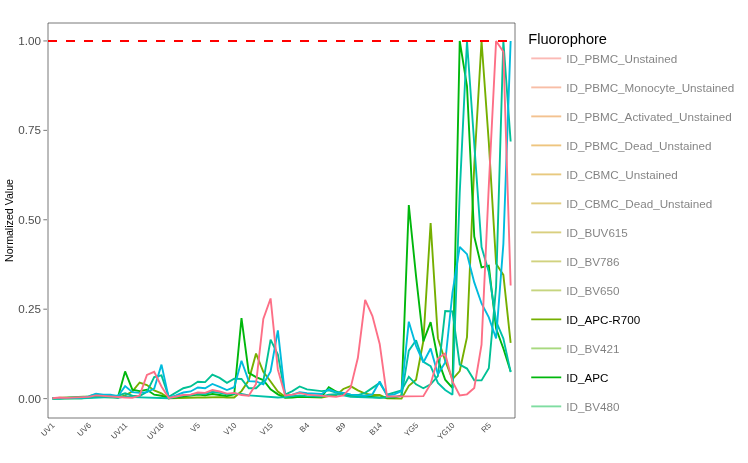
Having navigated our way through all the fluorophores for the last four lasers, we now reach the Red laser fluorophores. Similar to the Yellow-Green, for most PBMCs, we will not typically be encountering autofluorescence peaks, but might encounter tandem degradation style scenarios. Only time will tell, so lets go ahead and get started.
APC
.
Lets take a look at the “LinearSlices_Plot”, to see what effect would have been on the signature if we had split the region we had grabbed in our “positive” gate into 10% bins across based on MFI for the peak-detector.
.
No obvious signature variants across the bins. With this noted, we can next check the LuciernagaQC() output to see how the grouped individual cell normalized signatures output stored under “LuciernagaQC_Signatures” are behaving.
.
And as we might anticipate, we end up retrieving just a single signature. Before we call it, lets compare it to the reference using QC_WhatsThis()
Pass
For our APC unmixing control, we only get back a single signature from cells within our positive gated region, and the signature matches the reference. We are good to proceed to the next fluorophore.
Alexa Fluor 647
.
Next on the roster, we have Alexa Fluor 647, conjugated to Va7.2. This V-alpha chain would be found on subsets of T cells, importantly, the Mucosal-associated Invariant T cells (MAITs).
.
Lets first take a look at the “LinearSlices_Plot”, to see what effect would have been on the signature if we had split the region we had grabbed in our “positive” gate into 10% bins across based on MFI for the peak-detector.
.
With no obvious differences encountered, lets check the LuciernagaQC() output to see if grouping individual cell normalized signatures based on shared peaks of relatively similar height shows any hidden differences
.
Alright, the red laser fluorophores are making our lives simpler! (so far). Lets pass the signature data to QC_WhatsThis() and gage the difference vs. the reference.
                   Fluorophore ID_Average
1              Alexa Fluor 647       1.00
2                      APC-Cy5       1.00
3                        CF647       1.00
4                  cFluor R668       1.00
5                          Cy5       1.00
6                   eFluor 660       1.00
7  Fixable Viability Stain 660       1.00
8                   iFluor 647       1.00
9            Janelia Fluor 646       1.00
10           LIVE DEAD Far Red       1.00
11        MitoTracker Deep Red       1.00
12           RayBright Red 647       1.00
13             VIVAFIX 649-660       1.00
14                      CF640R       0.99
15                 DyLight 650       0.99
16         Live-or-Dye 640-662       0.99
17                MaxLight 650       0.99
18           NovaFluor Red 660       0.99
19             Vio Bright R667       0.99
20                    Vio R667       0.99
21           CoraLite Plus 647       0.98
22 Northern Lights 637 0.98Pass
For our Alexa Fluor 647 unmixing control, we only get back a single signature from cells within our positive gated region, and the signature matches the reference. We are good to proceed to the next fluorophore.
APC-R700
.
In terms of signatures, this one should be interesting, since the antibody was added to the cells during the stimulation with PMA-ionomycin. Any cells that degranulated in response would expose CD107a on their cell membrane, where it would be latched onto by the antibody-fluorophore. Subsequently, if re-internalized, the cell would still remain stained for APC-R700
.
However, there is also the risk that the additional exposure in culture may have resulted in non-specific staining for the fluorophore across all cells regardless if they degranulated. Additionally, being in culture with metabollically active cells for the extended period could mean the fluorophore was exposed to reactive-oxygen species (ROS) for longer, and may have degraded.
.
So if nothing else, lets see what information we can glean from this cell single-color unmixing control.
.
Starting off with the “LinearSlices_Plot”, lets see what the effect would have been on the signature if we had split the cells within our “positive” gate across 10% bins based on MFI for the peak-detector.
.
So far so good, no immediately noticible variation across the bins. Lets next check out the LuciernagaQC() output to see what grouped individual cell normalized signatures stashed under “LuciernagaQC_Signatures” are up to.
.
We end up with two signature variants, slightly different for their second “YG7” peak (likely due to how the rounding process happens behind the scenes in LuciernagaQC()). Lets visualize where the median signature ends up for comparison.
.
And the “ProportionPlot”
.
So rather equally split between the two, which adds to the argument the difference is likely a bit of noise in the detector measurement. Lets compare these two signature variants vs. the reference signature using QC_WhatsThis()
.
So both signatures end up with a cosine of 0.99. If we visualized these cosines, we get the following
Code
cos_vals <- c(1, 0.99)
theta <- acos(cos_vals)

df <- data.frame(
  label = paste0("cos = ", cos_vals),
  angle_deg = round(theta * 180 / pi, 1),
  x = sin(theta),
  y = cos(theta)
)

ggplot(df) +
  geom_segment(aes(x = 0, y = 0, xend = x, yend = y, color = label),
               arrow = arrow(length = unit(0.25, "cm")),
               linewidth = 1) +
  coord_fixed(xlim = c(-0.1, 1), ylim = c(-0.1, 1.1)) +
  geom_hline(yintercept = 0, color = "grey80") +
  geom_vline(xintercept = 0, color = "grey80") +
  labs(x = NULL, y = NULL, color = "Vector",
       title = NULL) +
  theme_bw()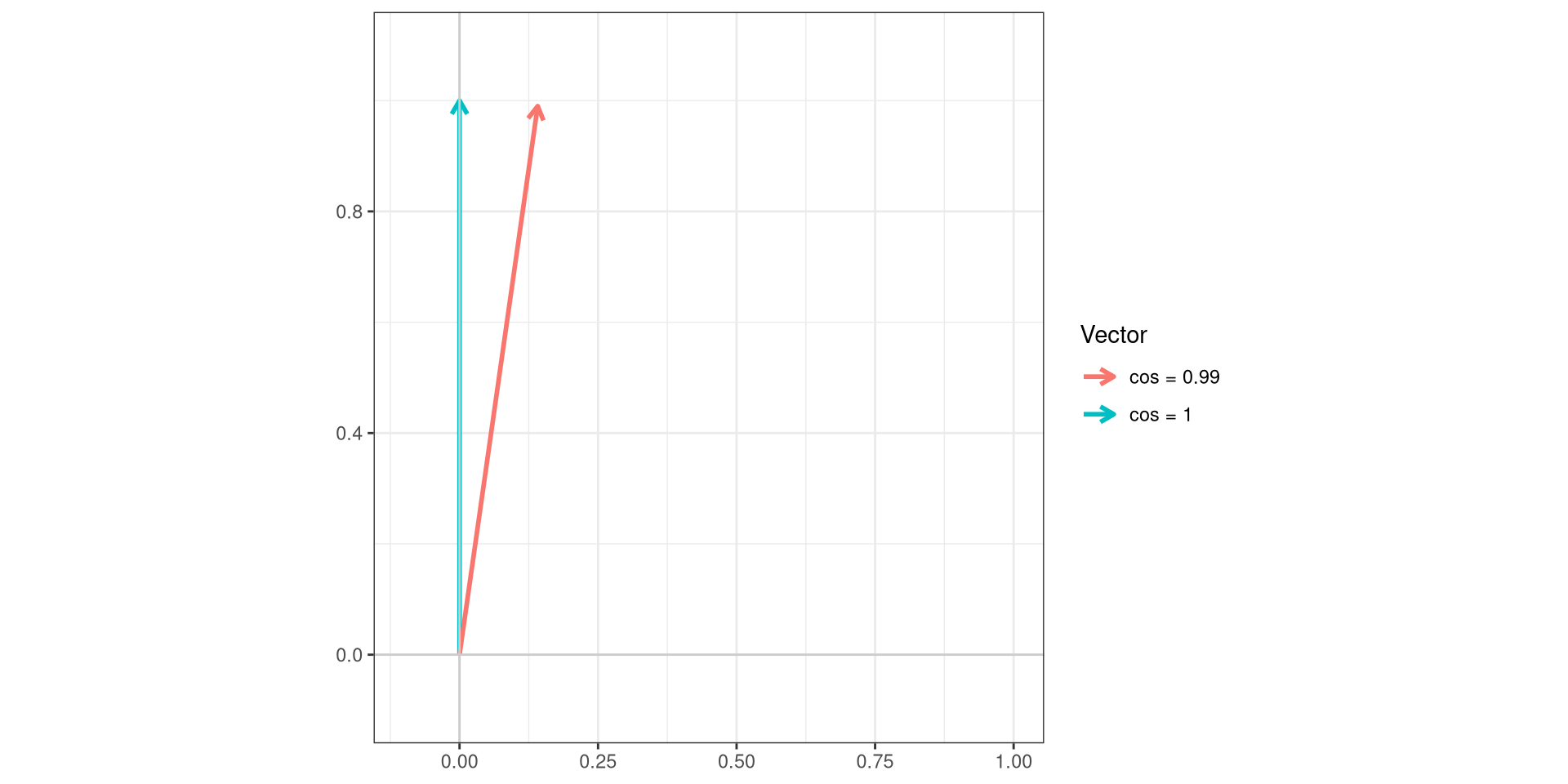
.
And lets check vs. the reference in the signature plot.
Pass
Our APC-R700 is in good shape, with both signature variants being identical to each other, with the only difference vs. the reference being slightly off in a couple of locations that are likely to be instrumental. We are safe to proceed to the next fluorophore.
Zombie NIR
.
We finally reach our viability dye Zombie NIR! Its mechanism of action is to link to exposed amines, which causes all cells to be positive for it (how bright being an effect of how well you titrated). However, for necrotic/apoptotic cells with holes in the membrane, the dye stains all the intracellular amines, resulting in our ability to discriminate these dead cells based on their brighter signal.
.
In this case, it is safer to just assume we are not going to be able to use the internal negative default for LuciernagaIntegration(), and just go ahead and use an external unstained.
.
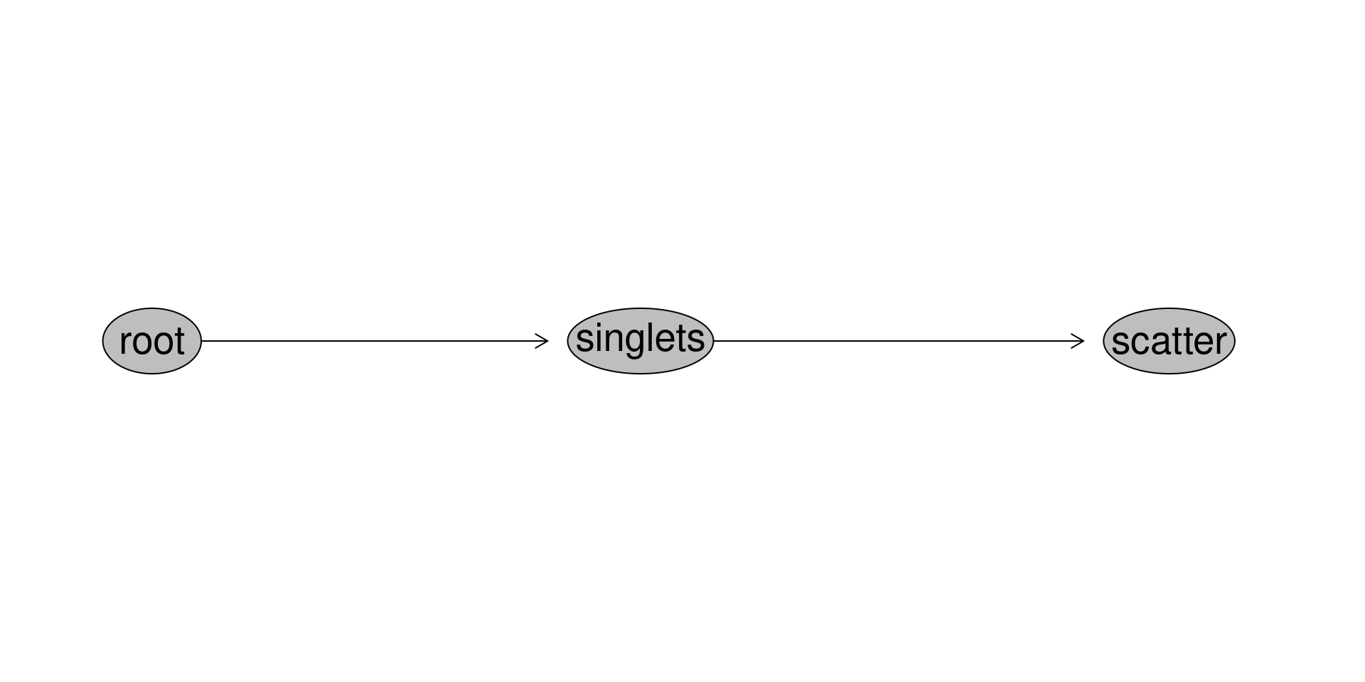
Copying our previuous code over from PE-Cy5, we can retrieve the Unstained GatingSet we pre-gated in a previous walkthrough using load_gs(). For this Zombie NIR control, the cells used where cord blood mononuclear cells, so we need to retrieve the INF052 Ctrl specimen
.
With this done, we can go ahead and run LuciernagaIntegration(), using the external background arguments.
.
With this done, lets take a look at the “LinearSlices_Plot”, to see what effect would have been on the signature if we had split the region we had grabbed in our “positive” gate into 10% bins across based on MFI for the peak-detector.
.
Based on getting back fairly uniform variants, it looks like our staining is sufficiently bright, as no evidence of leftover autofluorescence peaks can be seen. We can next check out the LuciernagaQC() output to see if when we group individual cell normalized signatures we see anything different.
.
When we visualize based on individual cells, we see a few cells have some variation around their individual fluorophore peaks, although the differences appear to be minor. Lets check the QC_Amalgate() output to see where the median signature ends up.
.
And then follow up by checking our “ProportionPlot” to see if any variant signature is predominantly present
.
So three main signatures, with 16% of our cells within the gagte actually having “R7-A” detector as their primary co-equal peak alongside “R6-A”. Is this instrumental noise? hand-waves-in-it-depends
.
Lets retrieve the three main signatures, and compare them against the reference signature using QC_WhatsThis()
Pass
Our Zombie NIR viability dye looks to be properly titrated and bright, with the three signature variants being essentially identical to each other and to the reference control. We are good to proceed to the next fluorophore.
APC-Fire 750
.
And for our final previously unexplored fluorophore we have APC-Fire 750, which is conjugated with CD27. Since CD27 is widely expressed by many T cell subsets, the antigen-by-fluorophore combination is likely to result in a bright signal. However, being an APC tandem, we might encounter issues with tandem degradation, so this may yet proove interesting.
.
We can first take a look at the “LinearSlices_Plot”, to see what effect would have been on the signature if we had split the region within our “positive” gate into 10% bins across based on MFI for the peak-detector.
.
After a rather uneventful last couple of fluorophores, we have some subtle hints of variation, notably, a little over autofluorescence background subtraction for “V8-A”, and a bit of a step-ladder appearance around the “R2-A” detector. The later is reminiscent to what we saw with the tandem degradation observed for APC-Fire 810 back during the Week 12 walk-through.
.
Lets go ahead and check out the LuciernagaQC() output to see what signature variants we get back when we group individual cell normalized signatures based on shared peaks of relatively similar heights.
.
Wooh! The step-ladder appearance persist, with the peak around the “YG10-A” detector being slightly different across the variants. However, we also get additional signal in “R1/R2-A”, for some, which is where we would anticipate the parent “APC” signature to be. Lets check the QC_Amalgamate() output to see where the median signature ends up by comparison.
.
So closer to the variants without “R1/R2-A” contribution. To confirm, lets check the “ProportionPlot” to see how the signature variants are represented across cells in our gated region.
.
So two of three more abundant signatures have little “R1/R2-A” contribution, while the other does have some contribution, which aligns with what we saw for the amalgamated plot.
.
Lets retrieve the underlying data, and filter() the median “Average” signature, as well as the variants with minimal and maxinum “R1/R2-A” contributions. We can then pass these individually to QC_WhatsThis_() and gage the difference vs. the reference.
                 Fluorophore ID_R7_10-R8_07-YG10_02
1        APC-Alexa Fluor 750                   1.00
2             APC-eFluor 780                   1.00
3               APC-Fire 750                   1.00
4                     APC-H7                   1.00
5             APC-iFluor 750                   1.00
6                cFluor R780                   1.00
7          CoraLite Plus 750                   1.00
8                   APC-C750                   0.99
9                    APC-Cy7                   0.99
10               APC-Vio 770                   0.99
11               DyLight 755                   0.99
12                 iFluor A7                   0.99
13           Alexa Fluor 750                   0.98
14                     CF750                   0.98
15 Fixable Viability Dye 780 0.98 Fluorophore ID_Average
1 APC-eFluor 780 1.00
2 APC-Fire 750 1.00
3 APC-H7 1.00
4 APC-iFluor 750 1.00
5 cFluor R780 1.00
6 APC-Alexa Fluor 750 0.99
7 APC-C750 0.99
8 APC-Cy7 0.99
9 APC-Vio 770 0.99
10 CoraLite Plus 750 0.99
11 iFluor A7 0.99
12 DyLight 755 0.98
13 Fixable Viability Dye 780 0.98
14 Fixable Viability Stain 780 0.98
15 Ghost Dye Red 780 0.98 Fluorophore ID_R7_10-R8_09-YG10_03
1 APC-eFluor 780 0.99
2 APC-H7 0.99
3 APC-Alexa Fluor 750 0.98
4 APC-Fire 750 0.98
5 APC-iFluor 750 0.98
6 cFluor R780 0.98
7 CoraLite Plus 750 0.98
8 iFluor A7 0.98
9 Fixable Viability Dye 780 0.97
10 GloCell Red 780 0.97
11 LIVE DEAD NIR 780 0.97
12 APC-C750 0.96
13 APC-Cy7 0.96
14 APC-Vio 770 0.96
15 DyLight 755 0.96.
If we visualized the difference in these angles, we would see the following
Code
cos_vals <- c(1, 0.98)
theta <- acos(cos_vals)

df <- data.frame(
  label = paste0("cos = ", cos_vals),
  angle_deg = round(theta * 180 / pi, 1),
  x = sin(theta),
  y = cos(theta)
)

ggplot(df) +
  geom_segment(aes(x = 0, y = 0, xend = x, yend = y, color = label),
               arrow = arrow(length = unit(0.25, "cm")),
               linewidth = 1) +
  coord_fixed(xlim = c(-0.1, 1), ylim = c(-0.1, 1.1)) +
  geom_hline(yintercept = 0, color = "grey80") +
  geom_vline(xintercept = 0, color = "grey80") +
  labs(x = NULL, y = NULL, color = "Vector",
       title = NULL) +
  theme_bw()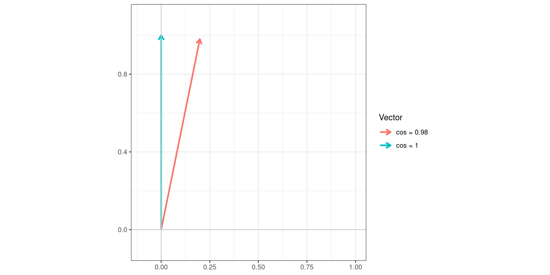
.
Before we call it, lets compare the median signature against the reference signature
Pass
Overall, our APC-Fire 750 signature is matching the reference, and is found widely across most of the cells within the gate. We are starting to pick up a few cells showing some tandem degradation signal, but it is overall contributing little to the overall signature. To be safe, I would move the gate a little to the right to hopefully reduce their contribution in favor of brighter staining cells in terms of MFI, that might have more intact APC-Fire 750 bound.
APC-Fire 810
.
And we are now back to the first fluorophore we examined back in the Week 12 walk-through; APC-Fire 810, conjugated to CD38. Since this marker is fairly prevalent on cord blood mononuclear cells that were used for this cell single-color unmixing control, the combination should be bright. Should, as we saw previously, biology still has a say.
.
We can take a look at the “LinearSlices_Plot”, to see what effect would have been on the signature if we had split the region we gated in our “positive” gate into 10% bins across based on MFI for the peak-detector.
.
Once again, minor step ladder for the autofluorescence region around “V7-A”, but more concerningly the bit of step-ladder around the “R1/R2-A” detector. We can check the LuciernagaQC() output to see what signatures we get back when we group individual cell normalized signatures based on shared peaks of relatively similar height.
.
And yup, after having gone through the full panel of fluorophores, this is the most dramatic example of tandem degradation so far. Lets visualize the same data an alternative fashion, checking to see where the median signature ends up by comparison.
.
Overall, the median signature ends up halfway up the step-ladder (by contrast, for APC-Fire 750 it was still toward the bottom of the “R1/R2-A” detector). We can check the proportion plot to measure the distribution of cells based on their signature variant
.
Overall, most signatures end up with “R1-A” as their secondary peak, with the majority of the cells having heights between 30-60% of the main “R8-A” peak height. Lets compare the signatures with minimal and maxinum “R1-A” detector contributions alongside the median “Average” signature vs. the reference control, using QC_WhatsThis()
                   Fluorophore ID_R8_10-R1_09-YG5_04
1                        CF633                  0.87
2                   iFluor 633                  0.85
3                          APC                  0.84
4                  cFluor R659                  0.84
5              Vio Bright R667                  0.84
6                       CF640R                  0.83
7          Live-or-Dye 640-662                  0.83
8          Northern Lights 637                  0.83
9            NovaFluor Red 660                  0.83
10                   SYTOX Red                  0.83
11                    Vio R667                  0.83
12        MitoTracker Deep Red                  0.82
13                ViaKrome 638                  0.82
14           CellTrace Far Red                  0.81
15                Thiazole Red                  0.81
16                     APC-Cy5                  0.80
17           RayBright Red 647                  0.80
18             Alexa Fluor 647                  0.79
19                       CF647                  0.79
20                 cFluor R668                  0.79
21                         Cy5                  0.79
22                  eFluor 660                  0.79
23                  iFluor 647                  0.79
24                      SBR670                  0.79
25           CoraLite Plus 647                  0.78
26 Fixable Viability Stain 660                  0.78
27           Janelia Fluor 646                  0.78
28           LIVE DEAD Far Red                  0.78
29                MaxLight 650                  0.78
30             VIVAFIX 649-660                  0.78
31      CellVue Claret Far Red                  0.77
32                 DyLight 650                  0.77
33                      CF660R                  0.75
34                       DRAQ5                  0.75
35                       DRAQ7                  0.75
36           NovaFluor Red 685                  0.74
37              SYTOX Deep Red                  0.74
38                  iFluor 660                  0.73
39                   APC-Cy5.5                  0.71
40                      BUV661                  0.71
41                      CF660C                  0.71
42                 cFluor R685                  0.71
43         Live-or-Dye 665-685                  0.71
44              mFluor Red 700                  0.71
45               Spark NIR 685                  0.71
46                 Zombie R685                  0.71
47             Alexa Fluor 660                  0.68
48 Fixable Viability Stain 700                  0.68
49                      CF680R                  0.67
50                       Cy5.5                  0.67
51                 cFluor R840                  0.66
52                  iFluor 670                  0.66
53           NovaFluor Red 710                  0.66
54           NovaFluor Red 725                  0.66
55         Live-or-Dye 615-740                  0.65
56        NovaFluor Yellow 660                  0.65
57                  ViaDye Red                  0.65
58                APC-Fire 810                  0.64
59              APC-iFluor 700                  0.64
60                       CF680                  0.64
61                 DyLight 680                  0.64
62      NovaFluor Blue 660-40S                  0.64
63                ViaKrome 808                  0.64
64 APC-Alexa Fluor 700 0.63.
So 0.64, 0.88 and 0.98 respectively in terms of cosine. If we visualized the difference in these angles, we would see the following
Code
cos_vals <- c(1, 0.98, 0.88, 0.64)
theta <- acos(cos_vals)

df <- data.frame(
  label = paste0("cos = ", cos_vals),
  angle_deg = round(theta * 180 / pi, 1),
  x = sin(theta),
  y = cos(theta)
)

ggplot(df) +
  geom_segment(aes(x = 0, y = 0, xend = x, yend = y, color = label),
               arrow = arrow(length = unit(0.25, "cm")),
               linewidth = 1) +
  coord_fixed(xlim = c(-0.1, 1), ylim = c(-0.1, 1.1)) +
  geom_hline(yintercept = 0, color = "grey80") +
  geom_vline(xintercept = 0, color = "grey80") +
  labs(x = NULL, y = NULL, color = "Vector",
       title = NULL) +
  theme_bw()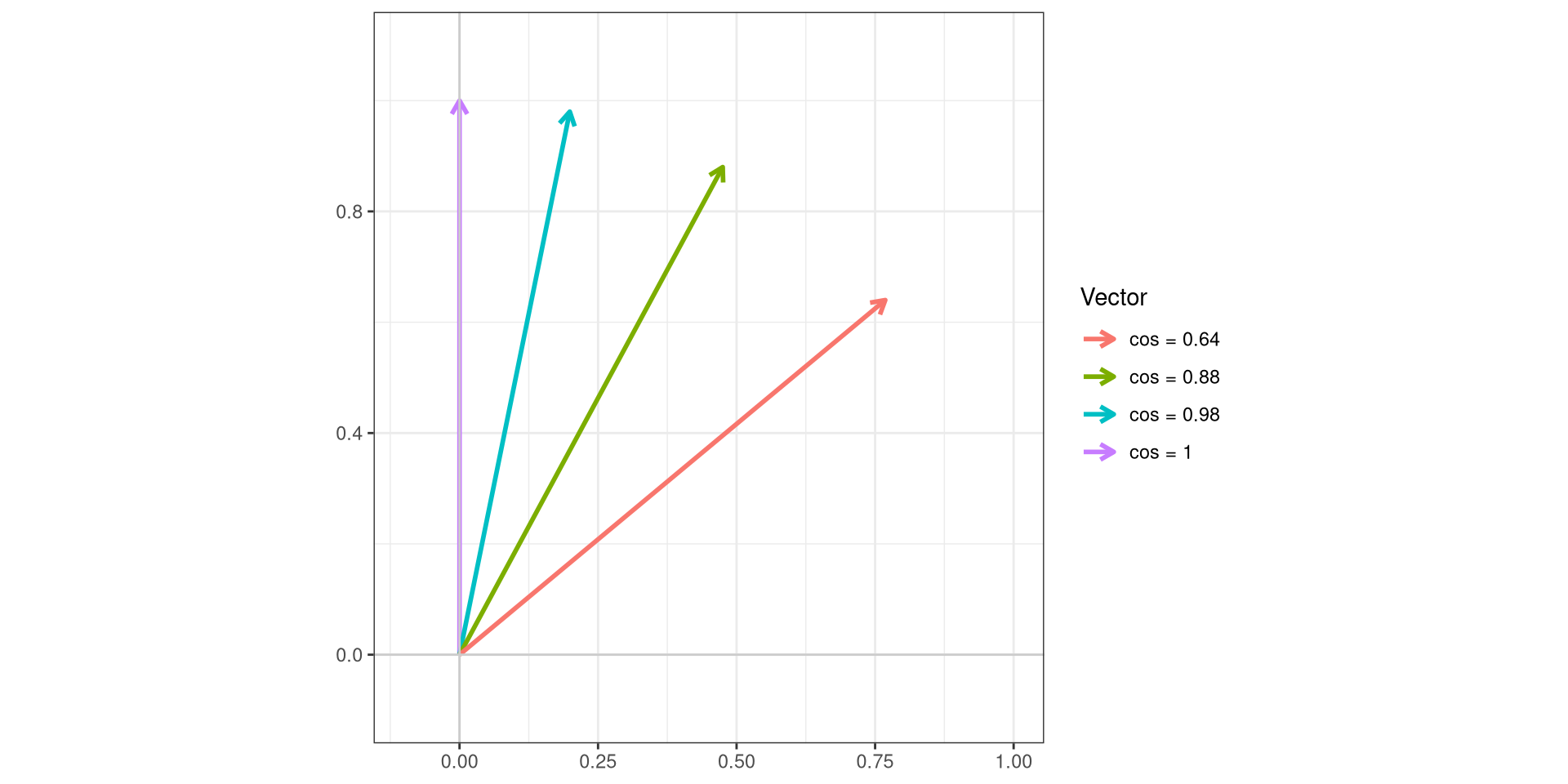
.
And finally contrasting the median signature compared to the reference
Fail
To many warning signs for this fluorophore. The median signature is substantially far away from the reference control, and the proportion of cells with the signature still intact are few. It is very evident that tandem degradation is occuring, and there is substantial amount of APC alone bound to the cell surface.
However, this brings up an interesting question. Given that both APC and APC-Fire 810 are present in the same panel, what is the best approach for unmixing? If we give accurate signature references for both, we maxize separation between both fluorophores, but we might confuse the signal arising from CD38-APC-via-degradation for CD16-APC.
Vice versa, if we provide the degraded signature with substantial APC presence, we might not have overcounting issues, but does the resolution between the two markers result in a nightmare trying to resolve between them.
We will explore these questions next time in the Evaluating Unmixing walk-through.
Redirects
.
Due to the sheer number of plotly ggplotly() interactive plots that the website would need to load if we had visualized all the LuciernagaIntegration() plots for the 29-fluorophore panel in one go, we have broken the exploration of the fluorophore outputs by laser. This walk-through was for the Red laser fluorophores.
.
- To return to the main walk-through (including UV fluorophores), click here
- For the violet fluorophore walk-through, click here
- For the blue fluorophore walk-through, click here
- For the yellow-green fluorophore walk-through, click here
- For the red fluorophore walk-through, click here
- For the unstained samples walk-through, click here

Additional Resources