Luciernaga Integration - Blue
2026-08-28



For the YouTube recording, see here
For screen-shot slides, click here
Background
.
Due to the sheer number of plotly ggplotly() interactive plots that the website would need to load if we had visualized all the LuciernagaIntegration() plots for the 29-fluorophore panel in one go, we have broken the exploration of the fluorophore outputs by laser. This walk-through if for the “Blue” laser.
.
- To return to the main walk-through (including UV fluorophores), click here
- For the violet fluorophore walk-through, click here
- For the blue fluorophore walk-through, click here
- For the yellow-green fluorophore walk-through, click here
- For the red fluorophore walk-through, click here
- For the unstained samples walk-through, click here
Walk-through
Set Up
.
Attach your R packages to the local environment via the library() call.
.
Designate your file paths to the storage and output folder locations.
.
Bring in the pre-gated GatingSet object (which was carried out as part of the Signature Matrices walkthrough).
.
And bring in the template needed to run the LuciernagaIntegration() wrapper function (which we generated here).
.
And with that, we are set!
Blue
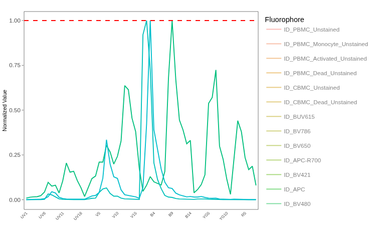
.
All fluorophores for the first two lasers examined, three more to go. Next up we have the Blue laser. While still subject to a little bit of autofluorescence in the early wavelengths around “B3-A”, but after that things become simpler… or at least, they would’ve except for whoever decided to add PerCP-Cy5.5 to the panel… oh wait, that was me, well, we all learn from our mistakes eventually.
.
We can go ahead and get started and see if we can identify anything concerning in terms of degrading tandems or bad antigen/fluorophore combinations resulting in autofluorescence residuals.
FITC
.
As increasingly routine at this point, we can check the “LinearSlices_Plot” output, to see what effect would have been on the signature if we had split the region we designated within our “positive” gate into 10% bins across.
.
No obvious differences, lets next check the LuciernagaQC() output to see what the grouped individual cell normalized signatures stored under “LuciernagaQC_Signatures” look like.
.
And we get back a single-signature variant, which giventhat FITC conjugated to an anti-CD3 antibody is going to be bright is kind of expected. Lets compare our retrieved signature vs. the reference using QC_WhatsThis() before moving on to the next fluorophore.
Pass
Only one signature is present for our FITC cell single-color unmixing control, so we can safely move on to the next fluorophore without worrying if we need to adjust the gate further.
Spark Blue 550
.
Next on the Blue laser docket, we have Spark Blue 550, also conjugated with CD3. Since this antigen is high-density, it should pair well with the less-bright Spark Blue 550. We will see if it is sufficiently bright to render any autofluorescence found on the “B3-A” detector neglible to the overall signature.
.
Accessing the “LinearSlices_Plot” output, we can see what the effect would have been on the signature if we had split the region inside our “positive” gate into 10% bins across.
.
No major difference in signature across the 10% bins, outside a bit of a smidge around “V7-A”. Lets next check the LuciernagaQC() grouped individual cell normalized signatures output stored under “LuciernagaQC_Signatures”.
.
Interesting, when grouping based on individual cell signatures, we can find a few that must not have been as brightly stained, with the residual autofluorescence ending up contributing more to the overall signature at “V7-A”. Lets check our QC_Amalgamate() output to see where the median signature ends up at.
.
The average seems to be shifted upwards, interesting. How common are the various signatures across the cells in the gated region?
.
Most of the signatures seem to have secondary peaks at “V7-A” with either 30-40% the height of the primary “B3-A” detector. Lets contrast the median “Average” signature to the signatures with the dimmest and brigtest “V7-A” detector contributions and see how this differs vs. the reference.
.
Interesting, so the variants with both higher and lower “V7” are those that are more distinct compared to the reference. Not by much, but if we visualized the difference in the cosine values, we would see the following
Code
cos_vals <- c(1, 0.98)
theta <- acos(cos_vals)

df <- data.frame(
  label = paste0("cos = ", cos_vals),
  angle_deg = round(theta * 180 / pi, 1),
  x = sin(theta),
  y = cos(theta)
)

ggplot(df) +
  geom_segment(aes(x = 0, y = 0, xend = x, yend = y, color = label),
               arrow = arrow(length = unit(0.25, "cm")),
               linewidth = 1) +
  coord_fixed(xlim = c(-0.1, 1), ylim = c(-0.1, 1.1)) +
  geom_hline(yintercept = 0, color = "grey80") +
  geom_vline(xintercept = 0, color = "grey80") +
  labs(x = NULL, y = NULL, color = "Vector",
       title = NULL) +
  theme_bw()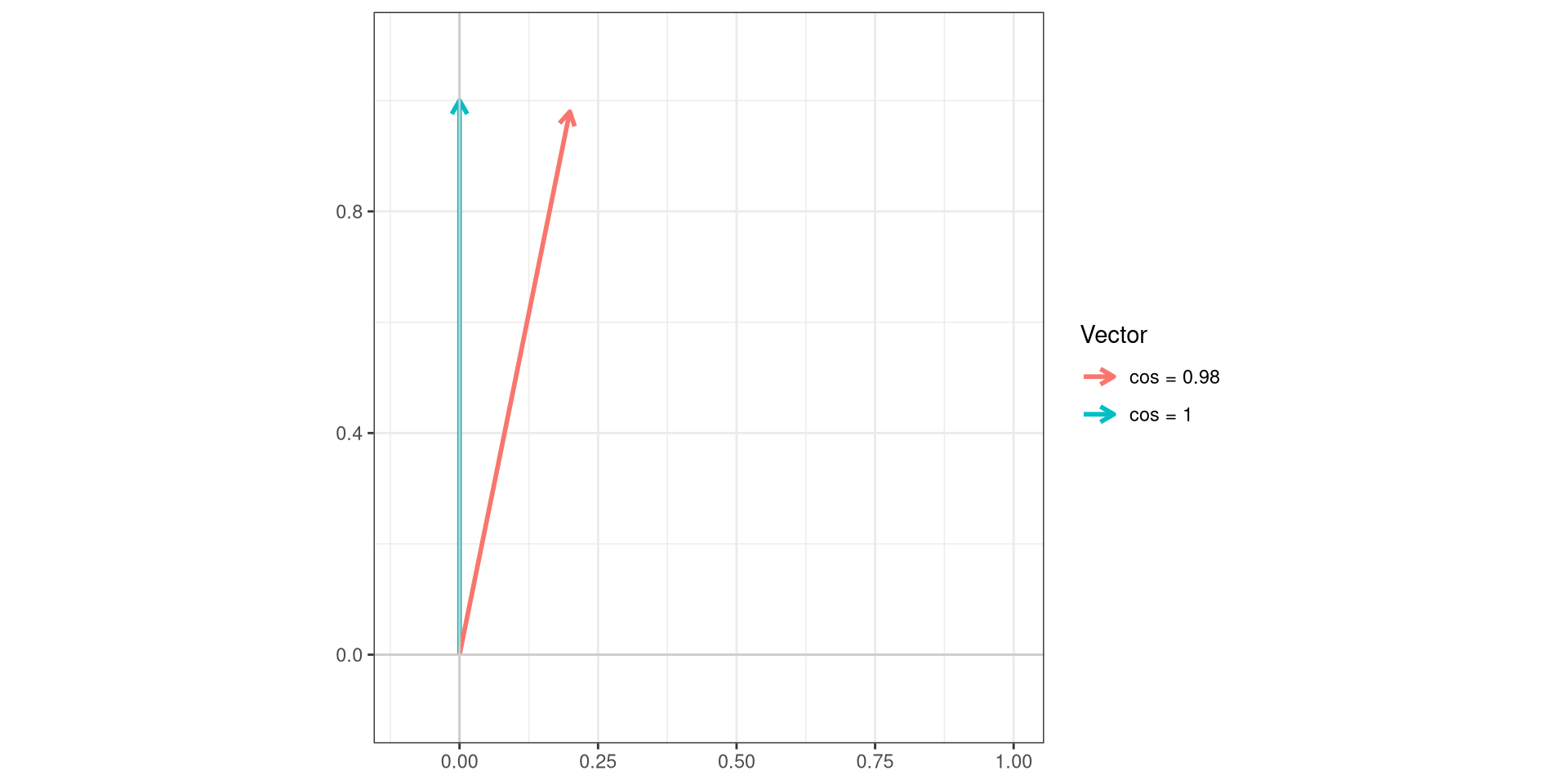
Pass
Spark Blue 550 appears to be in good shape for the majority of the cells that are represented, matching the reference control. The variants that have a cosine of 0.98 are only 7% of overall cells, so if we really wanted to reduce their contribution, we could try shifting the gate slightly to the right (given the antigen is CD3, it is not like we don’t have enough cells to be able to do this.)
PerCP-Cy5.5
.
Alright, worst fluorophore, PerCP-Cy5.5, you are up :/. For this panel, it is conjugated to CD26, which should be present on various T cell subsets. So it has the potential to be sufficiently bright. However, this will depend on the overall brightness of the PerCP-Cy5.5, which will depend on how the tandem inside the individual fluorophore vial is doing.
.
Lets start by glancing at our “LinearSlices_Plot”, to see what effect would have been on the signature if we had split the region in our “positive” gate into 10% bins across.
.
We can see clear distinct step-ladders for our “V7-A”, “UV7-A” and “B3-A” peaks. From this view, the 5 peaks of PerCP-Cy5.5 appear to be consistent, although some are showing signs of some variation, similar to what we saw for the APC-Fire 810 fluorophore during Week 12.
.
Lets see what is hiding behind the curtain in this case, lets examine the LuciernagaQC() output to see what happens when we group individiual cell normalized signatures based on their shared peaks of relative similar heights.
.
We have another fuzzy caterpillar, albeit less fuzzy than BUV737! We have presence of autofluorescence residual step-ladders for most of the signatures, but also examining the area around 4/5 PerCP-Cy5.5 peaks, we can see they have their own version of step-ladders.
.
It is likely we have some tandem degradation, alongside maybe not sufficiently bright antibody-fluorophore combination that is leaving the stained cells relatively dim overall.
.
Checking the QC_Amalgamate() output, lets see where the median signature ends up at when we include all the cells within the positive gated region.
.
Alright, moment of truth, how are the different signature variants represented across the gated cells?
.
So 3 signatures with more than 10% representation, all relatively similar to each other. Lets go ahead and grab these, as well as the “Average”, and compare them to each other and the reference signature using QC_WhatsThis().
.
So overall, these more abundant signature variants are close to their reference control. But what about the others 10-20%?
.
If we visualized the difference in these angles, we would see the following
Code
cos_vals <- c(1, 0.99, 0.97, 0.96)
theta <- acos(cos_vals)

df <- data.frame(
  label = paste0("cos = ", cos_vals),
  angle_deg = round(theta * 180 / pi, 1),
  x = sin(theta),
  y = cos(theta)
)

ggplot(df) +
  geom_segment(aes(x = 0, y = 0, xend = x, yend = y, color = label),
               arrow = arrow(length = unit(0.25, "cm")),
               linewidth = 1) +
  coord_fixed(xlim = c(-0.1, 1), ylim = c(-0.1, 1.1)) +
  geom_hline(yintercept = 0, color = "grey80") +
  geom_vline(xintercept = 0, color = "grey80") +
  labs(x = NULL, y = NULL, color = "Vector",
       title = NULL) +
  theme_bw()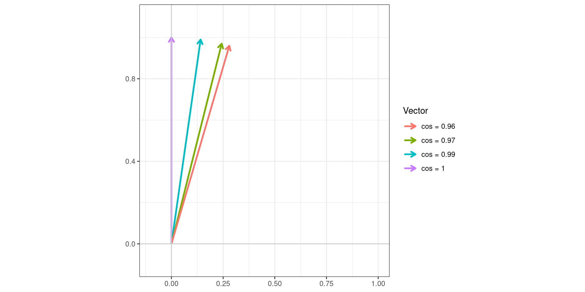
Caution
Overall, the cells within our gated region are mostly representative of the reference “PerCP-Cy5.5” signature, not exact, but close enough we can’t rule out just manufacturer difference as far as the Cy5.5 conjugation.
We have somewhere between 10-20% in rougher shape with additional autofluorescence leftovers in the overall signature, but if we tighten up the gate, and shift it to right we can reduce these, and likely have this cell single-color control work well enough for this particular experiment. Whether this is the case for the other acquisition days remains a question for another day.
Redirects
.
Due to the sheer number of plotly ggplotly() interactive plots that the website would need to load if we had visualized all the LuciernagaIntegration() plots for the 29-fluorophore panel in one go, we have broken the exploration of the fluorophore outputs by laser. This walk-through was for the Blue laser fluorophores.
.
- To return to the main walk-through (including UV fluorophores), click here
- For the violet fluorophore walk-through, click here
- For the blue fluorophore walk-through, click here
- For the yellow-green fluorophore walk-through, click here
- For the red fluorophore walk-through, click here
- For the unstained samples walk-through, click here
Additional Resources