06 - Visualizing with ggplot2
2026-03-17

![]()
![]()
For the YouTube livestream schedule, see here
For screen-shot slides, click here
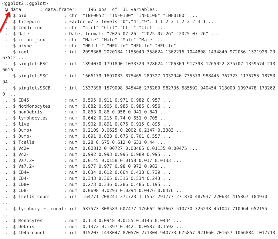
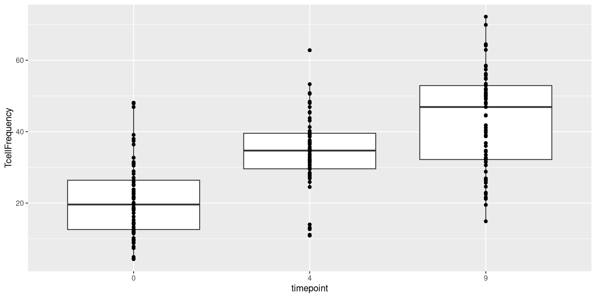
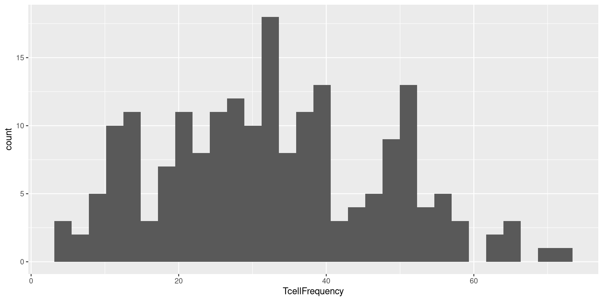
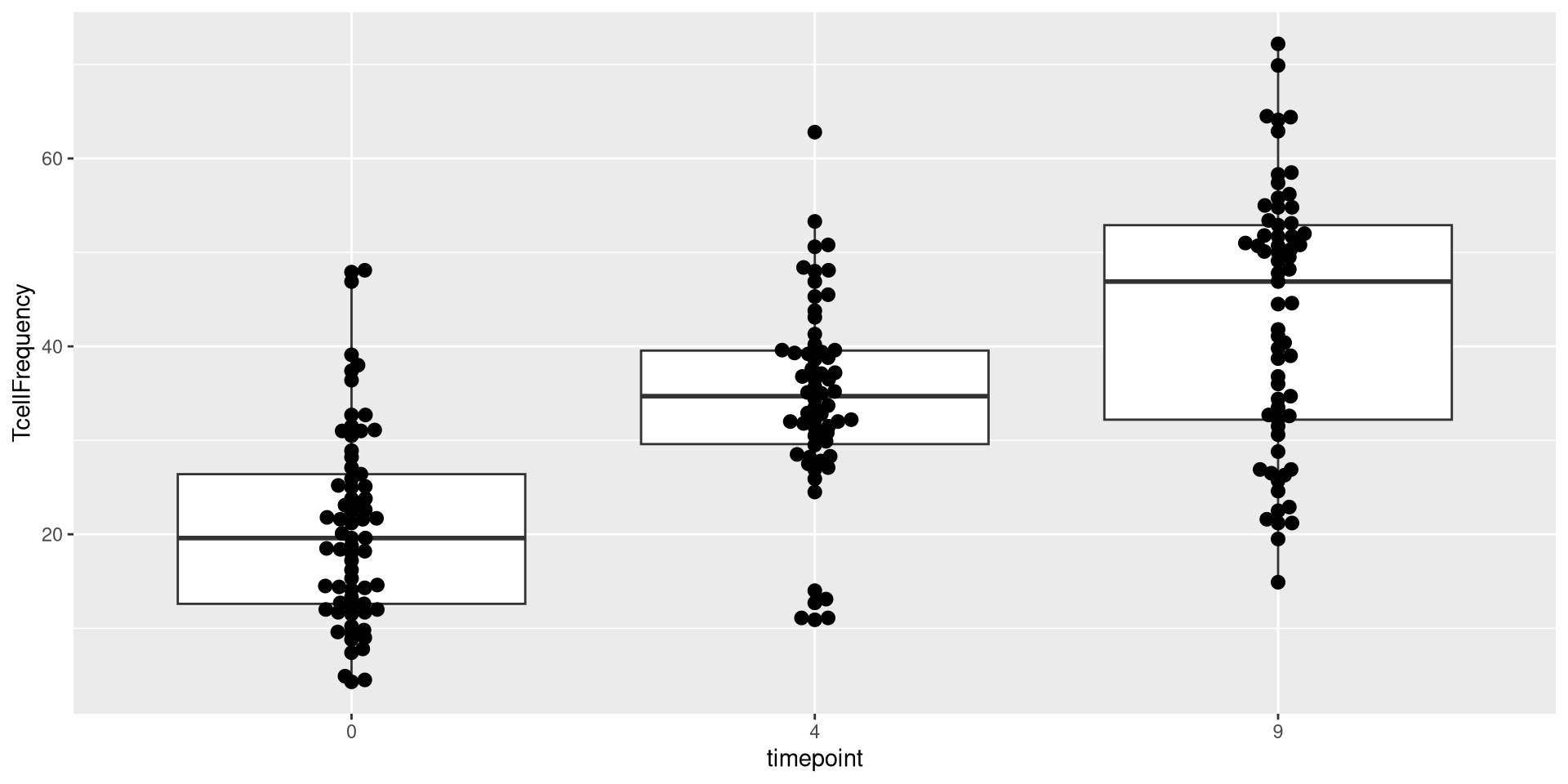
Data


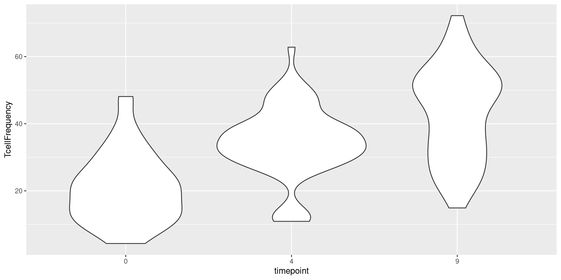
or geom_violin()
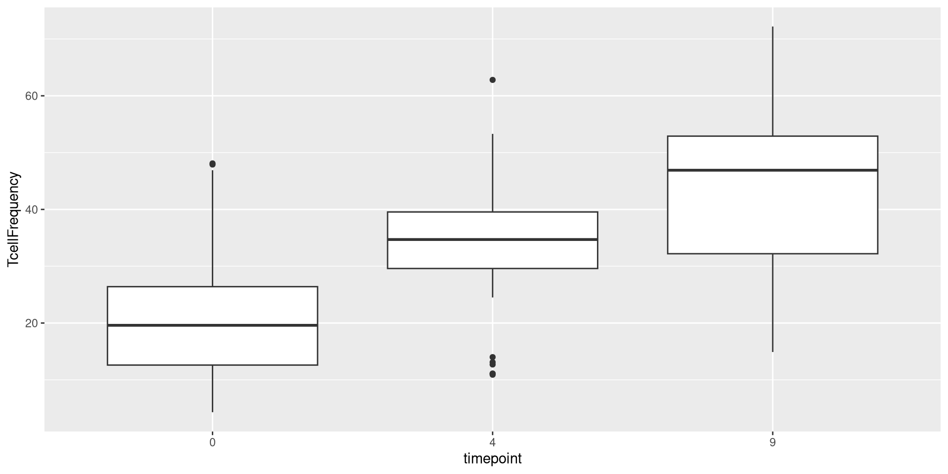
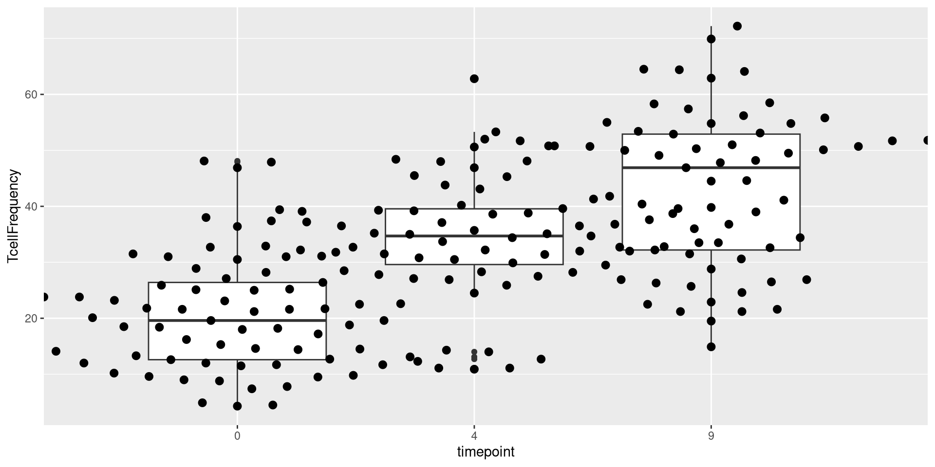
We could also add two geometries

AlternateData <- read.csv(TheCSV, check.names=FALSE)
AlternateData <- AlternateData |>
mutate(TcellProportion=Tcells_count/CD45_count) |>
mutate(TcellFrequency=TcellProportion *100) |>
mutate(TcellFrequency=round(TcellFrequency, 1))
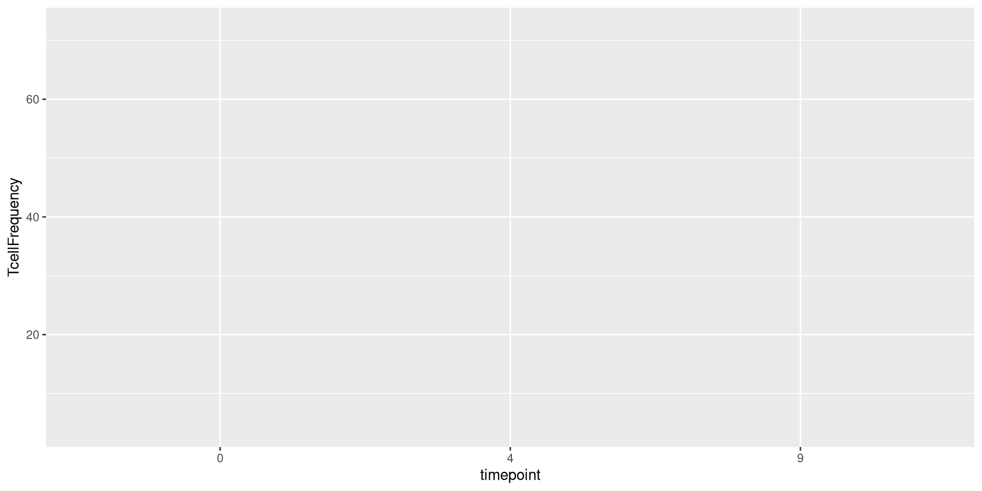
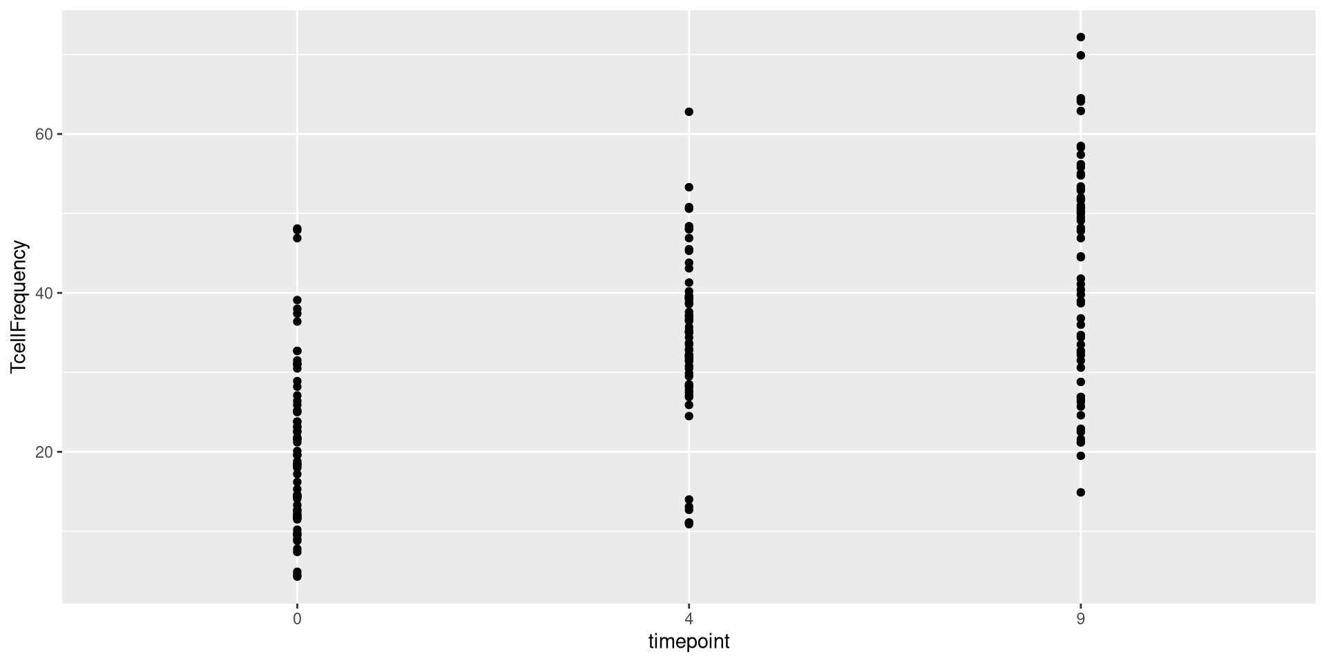
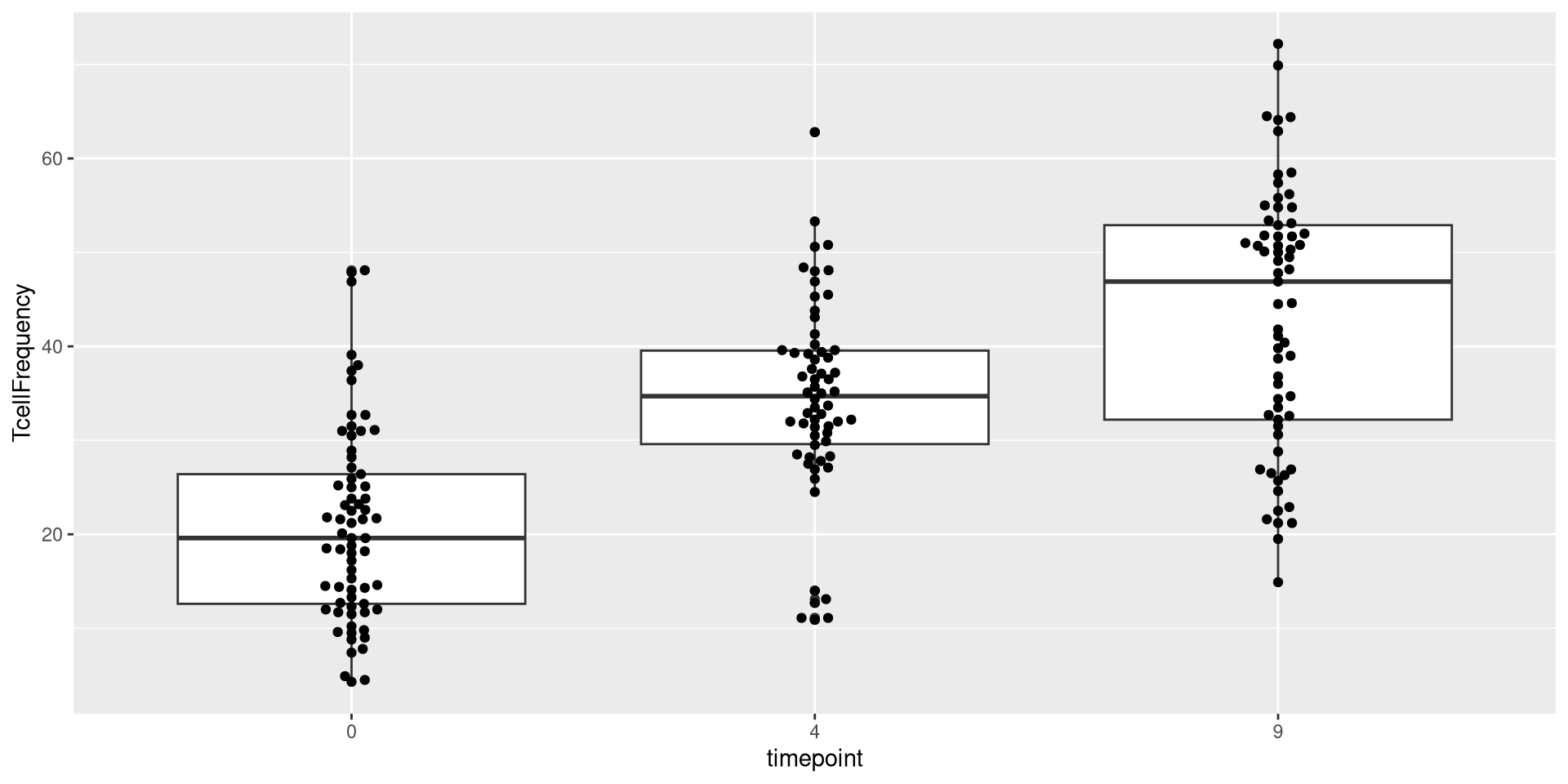
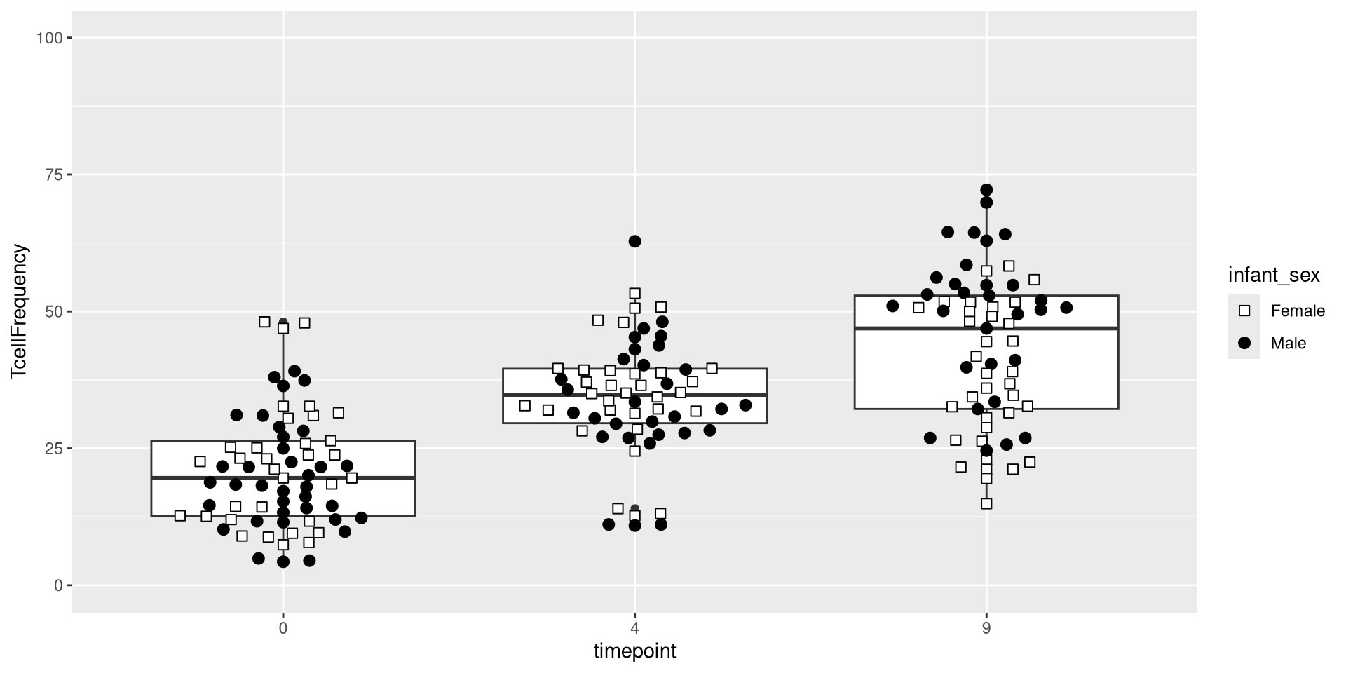
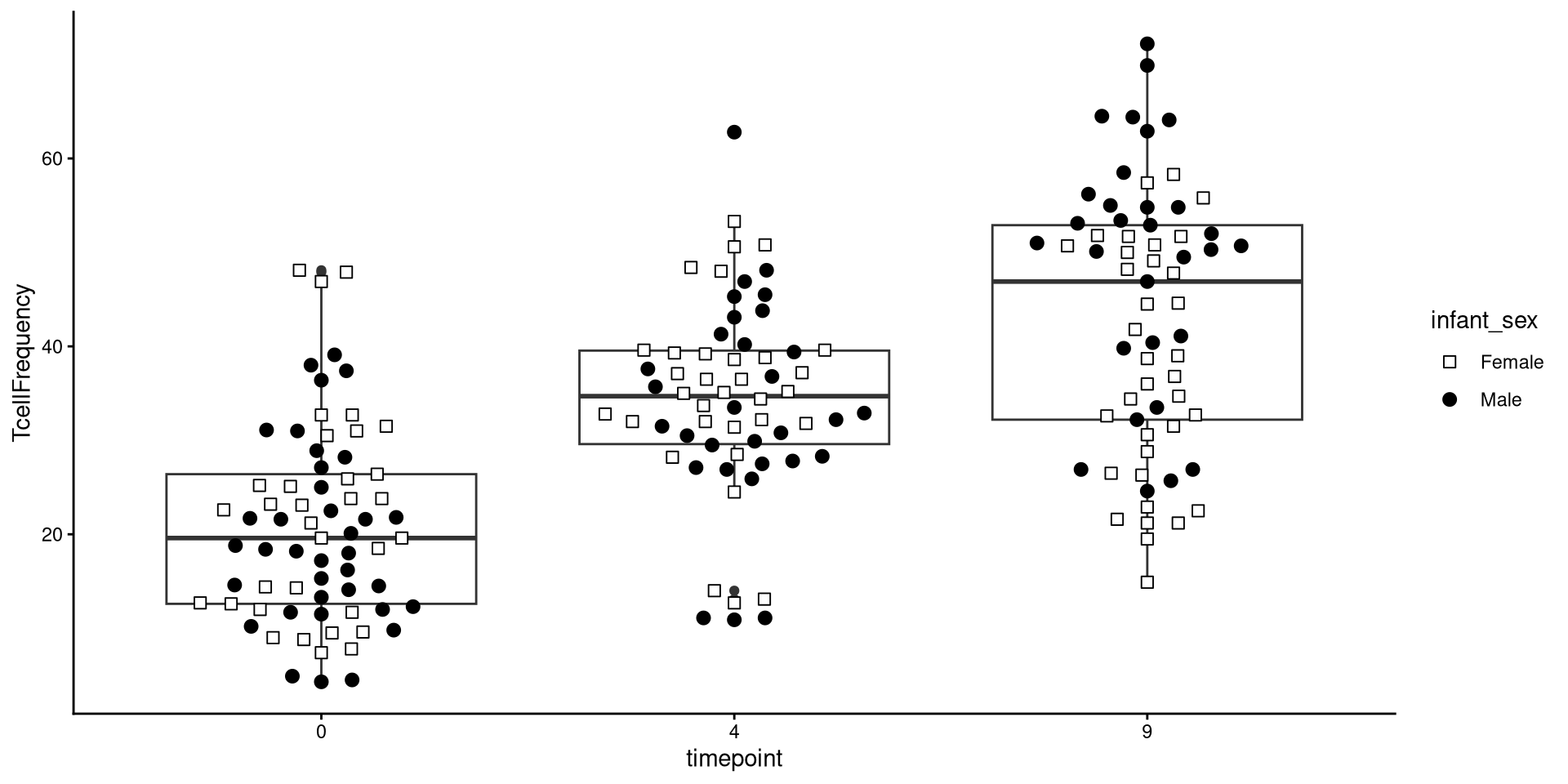
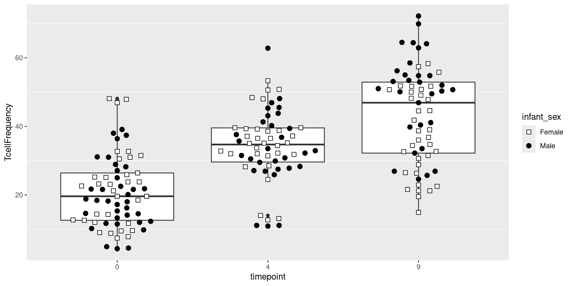
ggplot(AlternateData) + aes(x=timepoint, y=TcellFrequency) + geom_beeswarm()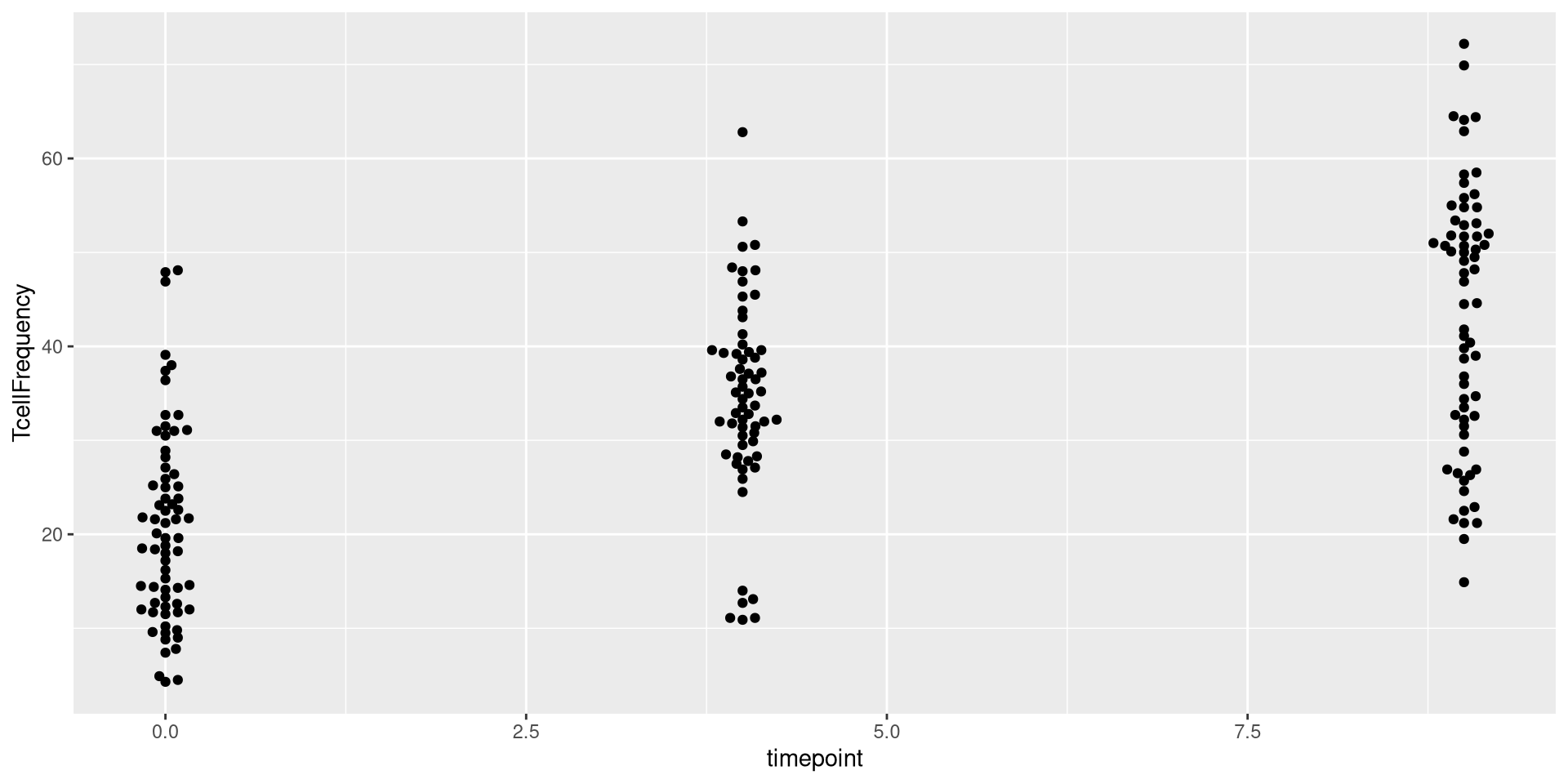
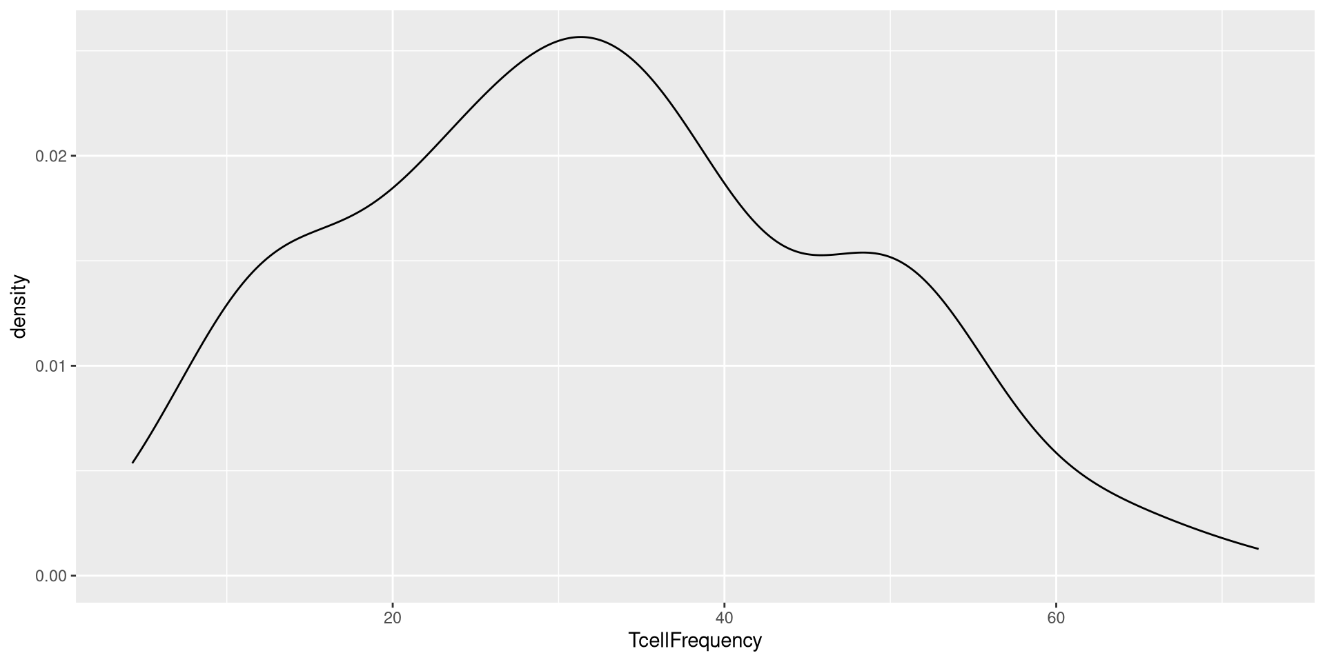
This would similarly be the case for geom_density()
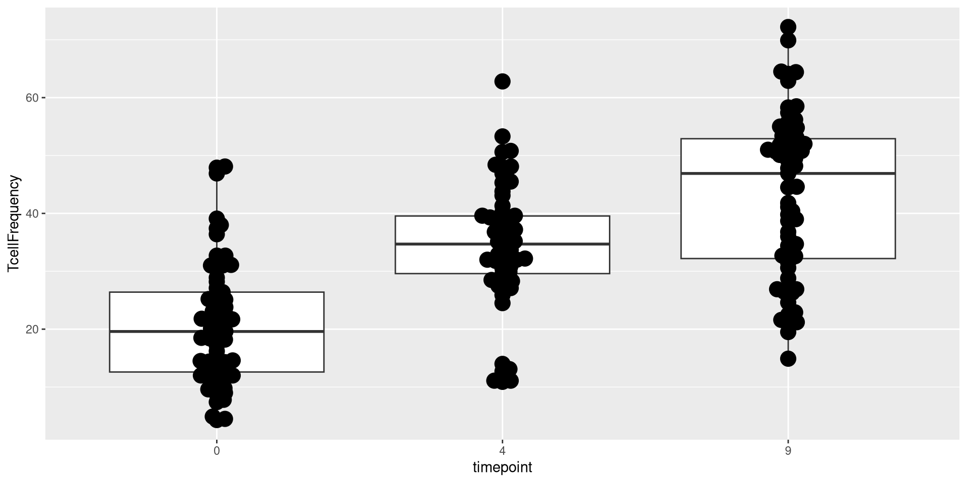
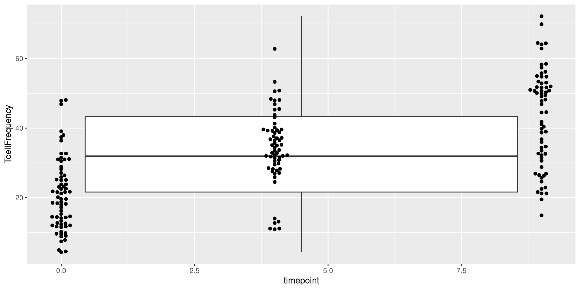
Waaaaay toooo large. Let’s tone it back.
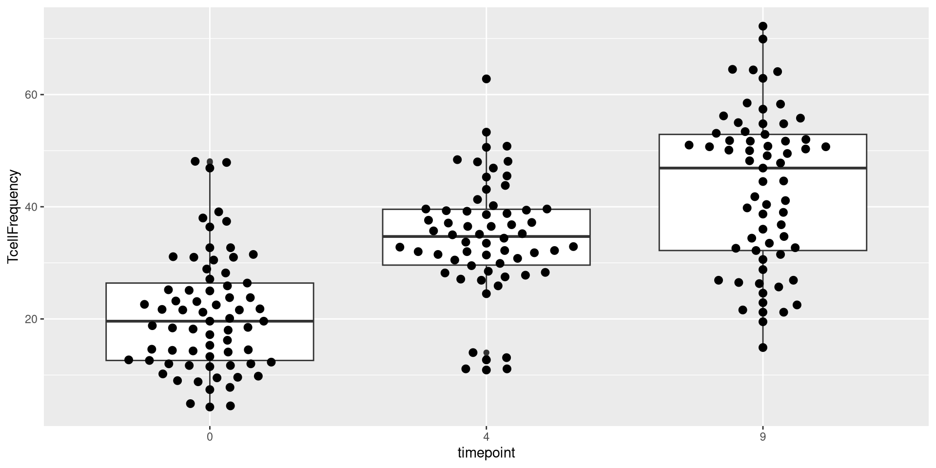
.
Upps! Too far! Let’s adjust it again


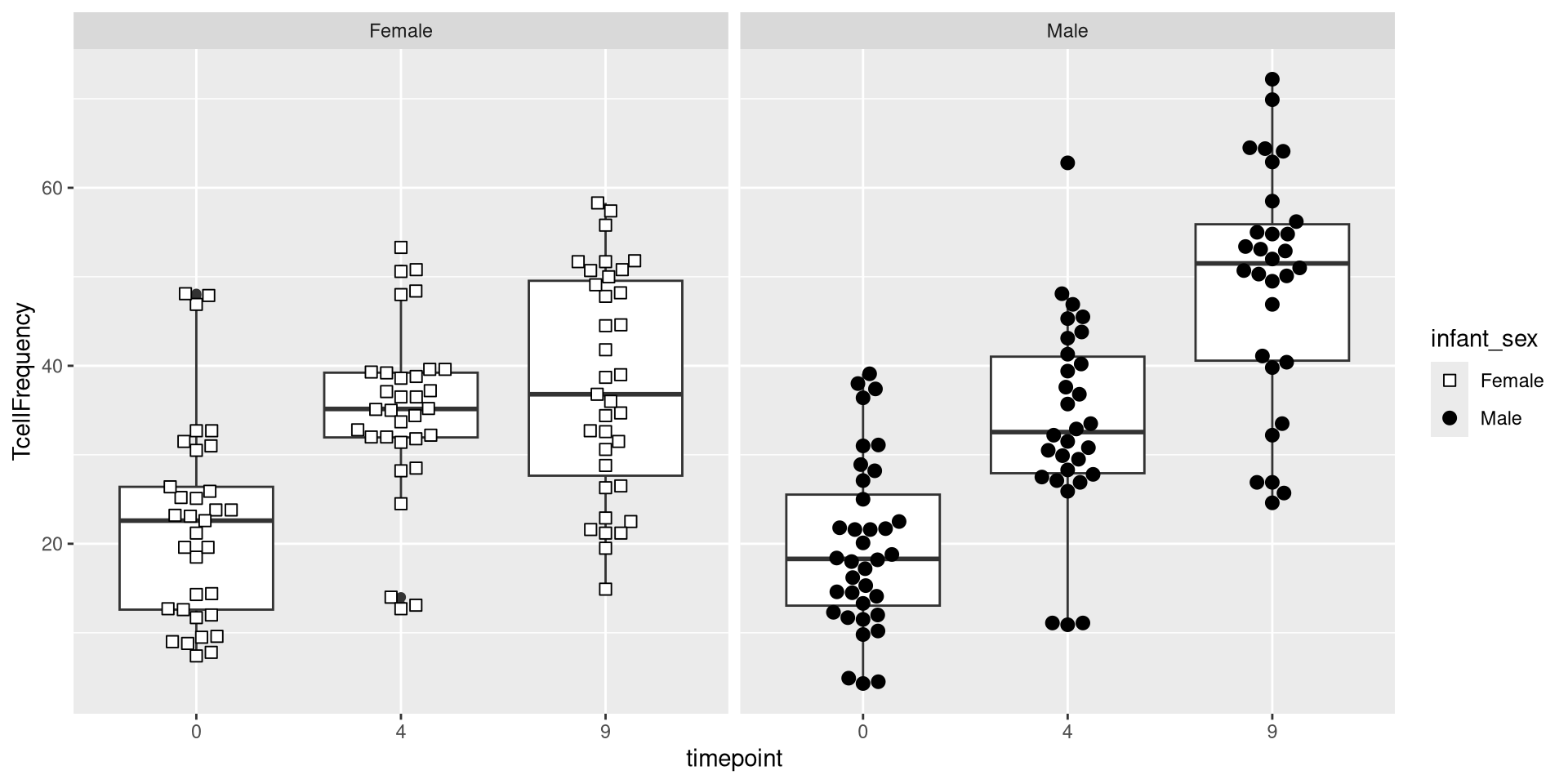
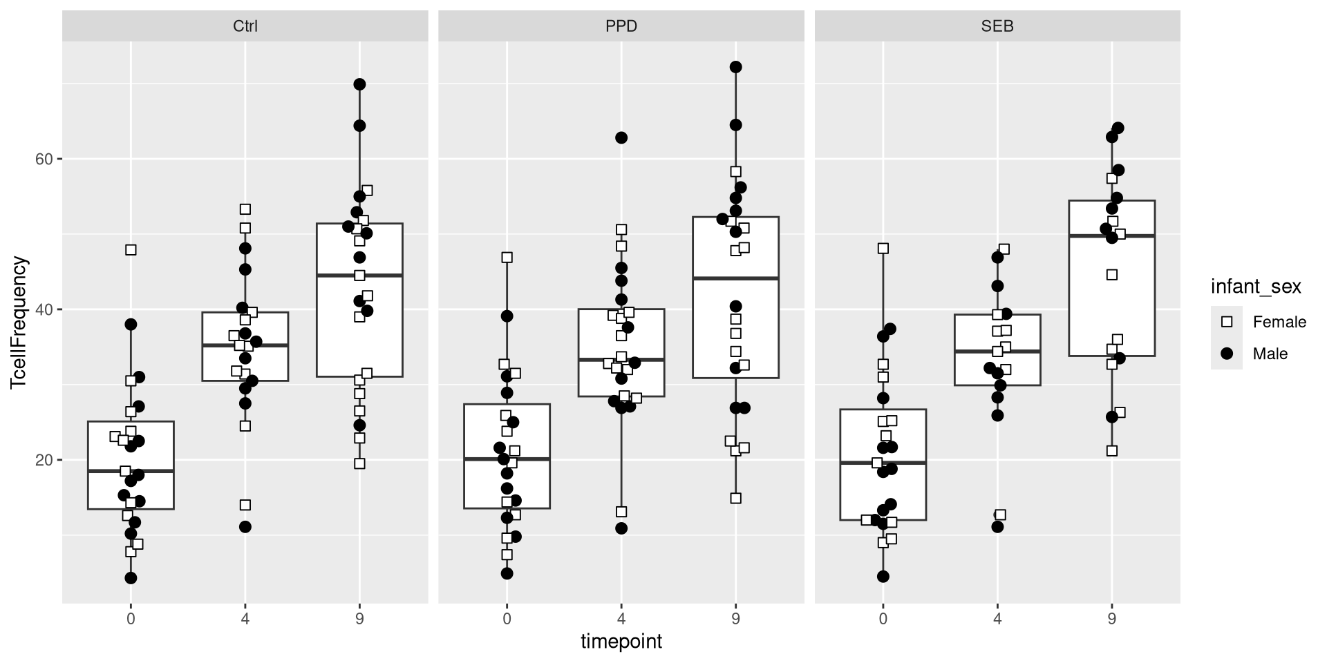

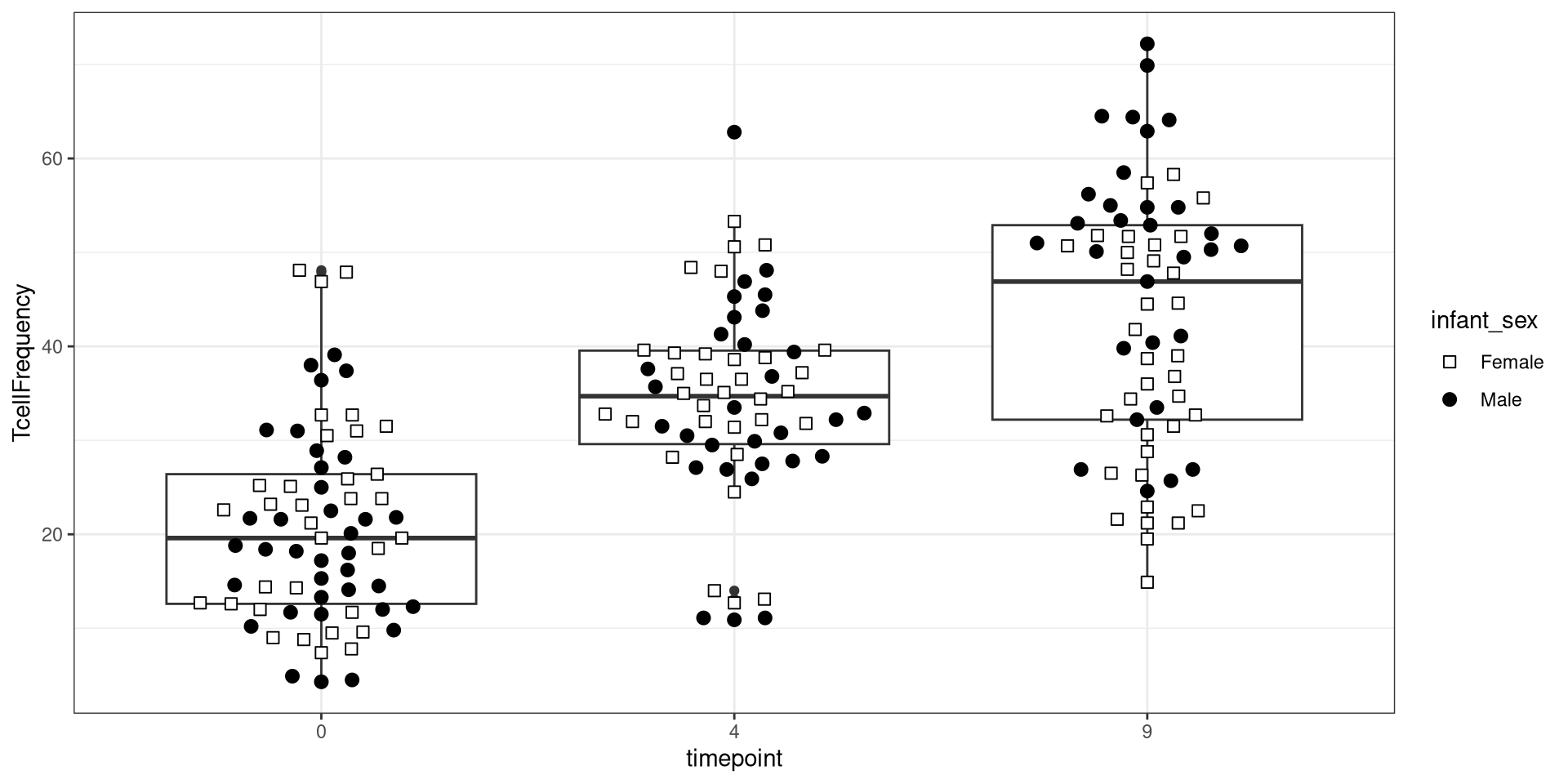

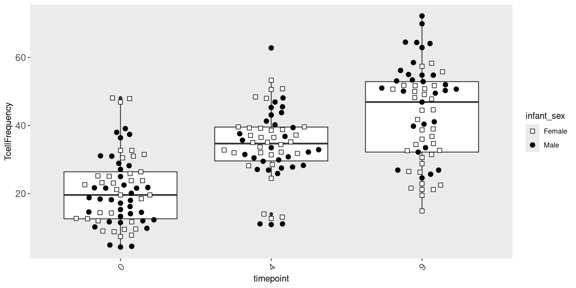
ggplot(Data) + aes(x=timepoint, y=TcellFrequency) +
    geom_boxplot() + geom_beeswarm(size=2.5, cex=2.5, aes(shape=infant_sex, fill=infant_sex)) +
scale_shape_manual(values=shape_sex) + scale_fill_manual(values=fill_sex) +
theme(
panel.grid.major = element_blank(),
panel.grid.minor = element_blank(),
axis.text.x = element_text(angle=45, hjust=1, size = 16))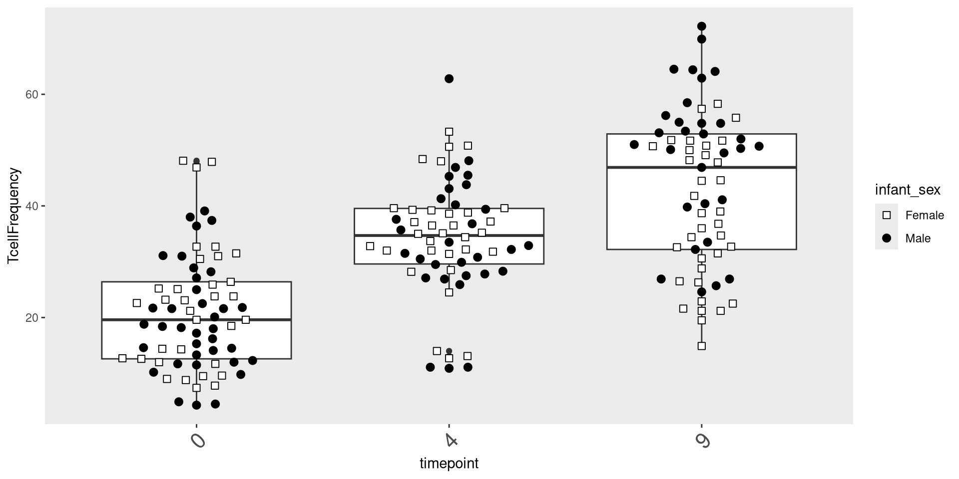
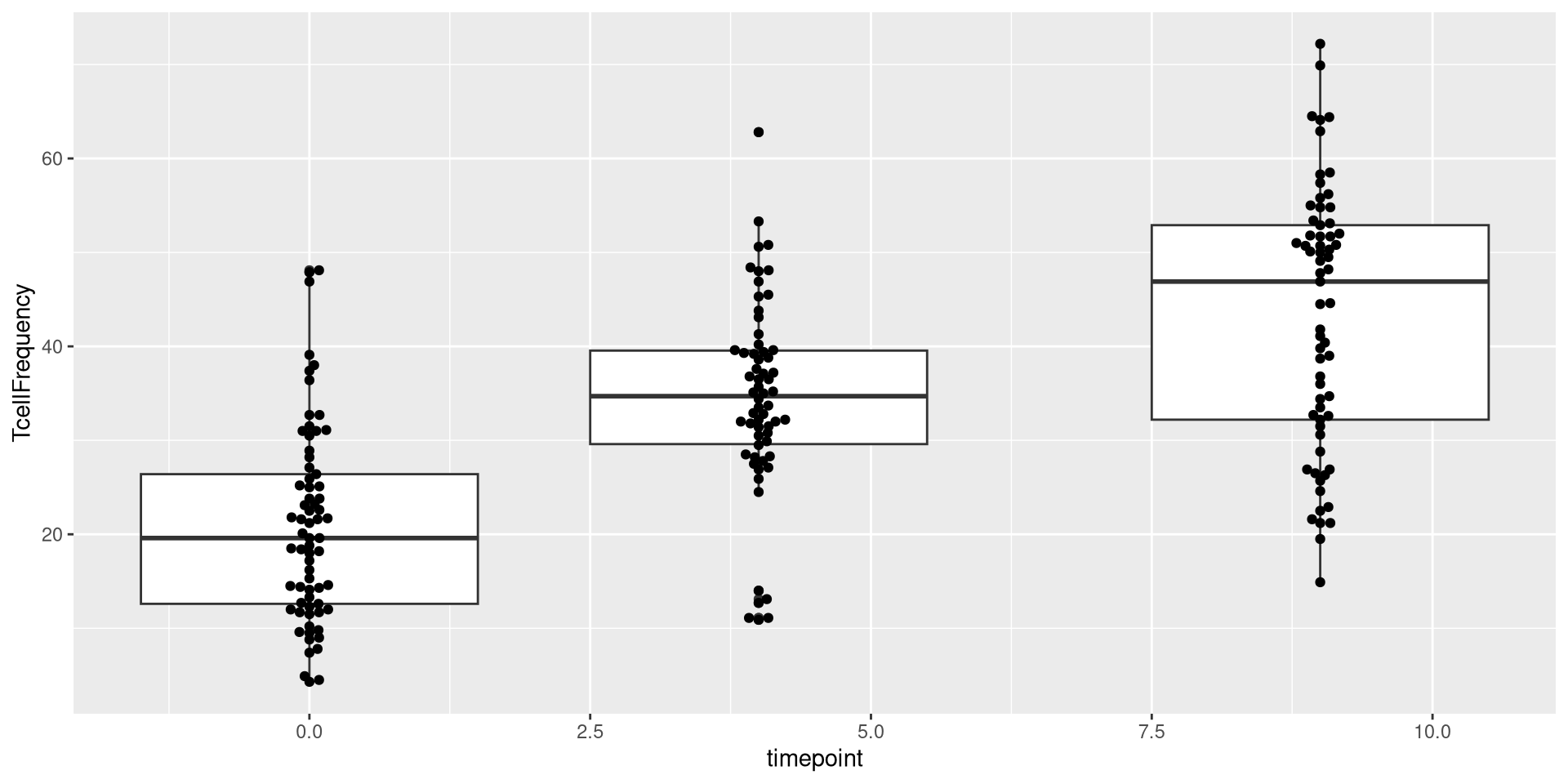
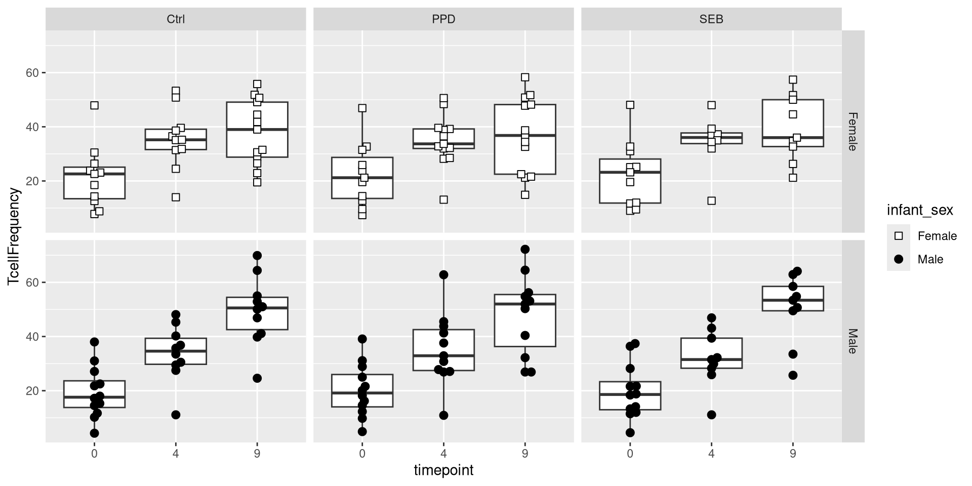
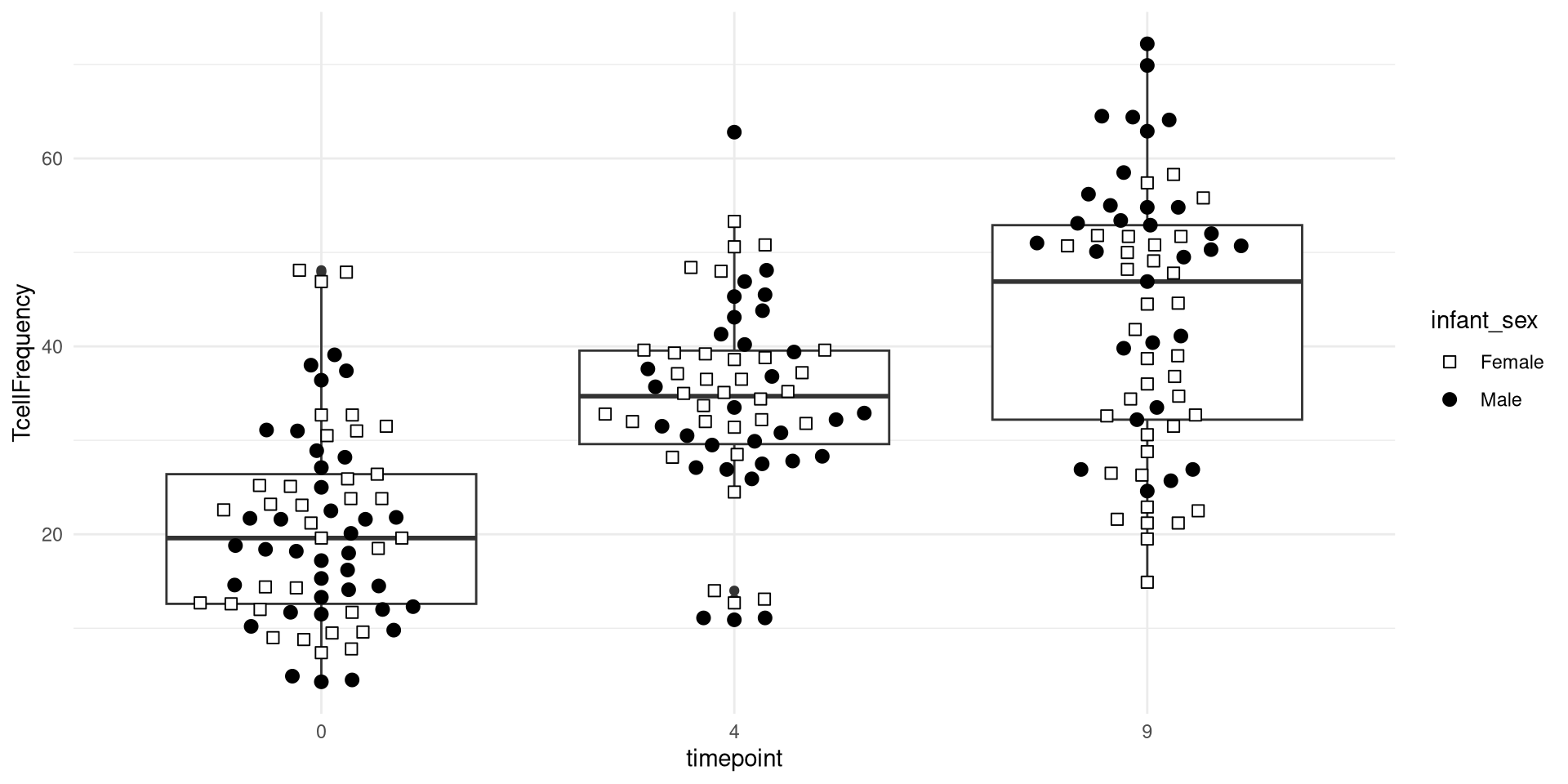
ggplot(Data) + aes(x=timepoint, y=TcellFrequency) +
     geom_boxplot() + geom_beeswarm(size=2.5, cex=2.5, aes(shape=infant_sex, fill=infant_sex)) +
scale_shape_manual(values=shape_sex) + scale_fill_manual(values=fill_sex) +
theme(
panel.grid.major = element_blank(),
panel.grid.minor = element_blank(),
axis.text.x = element_text(angle=45, hjust=1, size = 12),
axis.text.y = element_text(size=12))